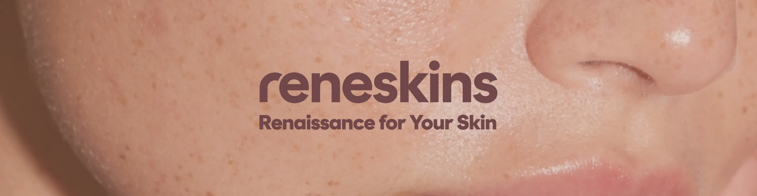
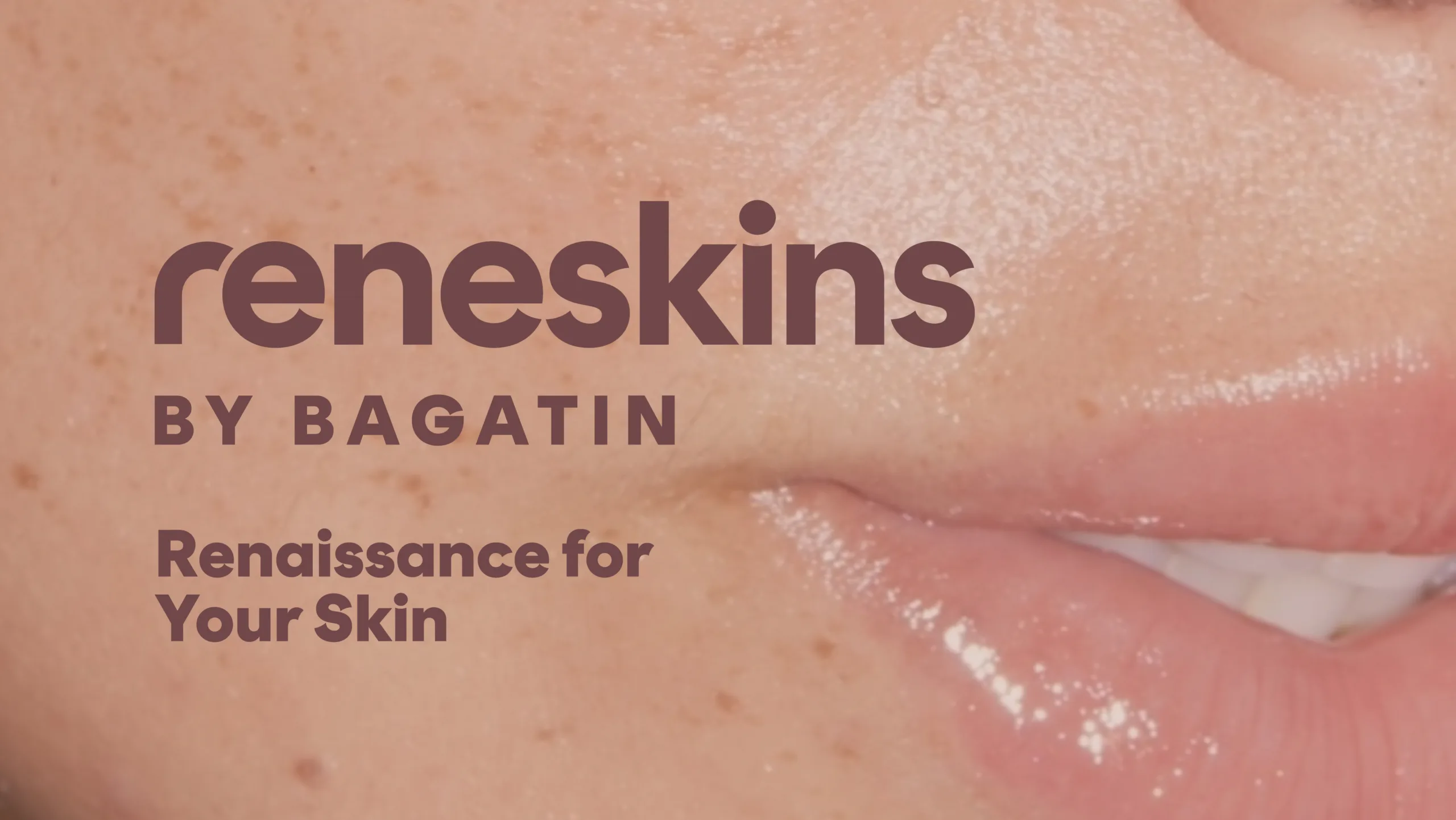
Reneskins by Bagatin
One-stop-shop for beauty treatments
Reneskins by Bagatin is a new name and concept developed from the former Manuela Picard Brows & Beauty aesthetic centers. For this launch, we crafted the full brand strategy — including the name, slogan, brand story, and visual identity. Positioned as a unique offering on the Croatian market, Reneskins bridges the best of cosmetology, dermatology, and medical aesthetics. A professional team, advanced technology, and highly effective treatments deliver visible results — all while offering a wide spectrum of services that make Reneskins a true one-stop-shop for beauty care.
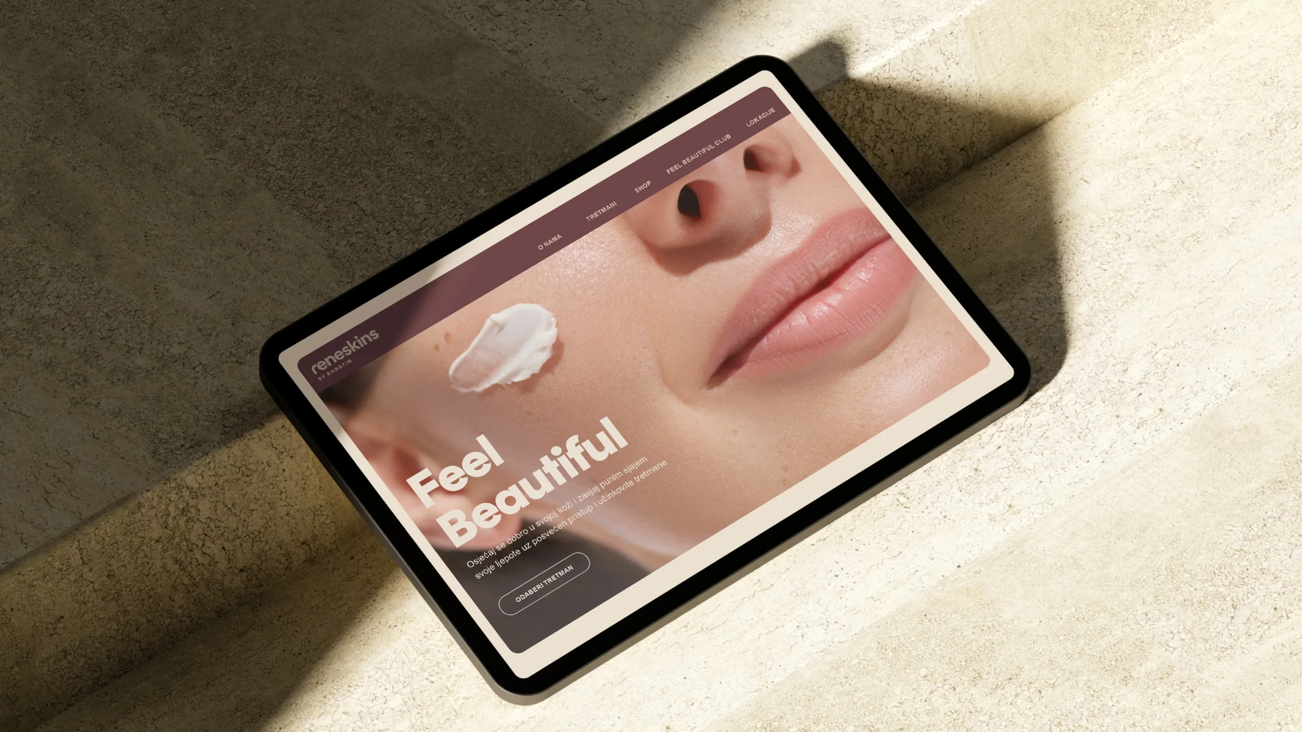
Shine with the Full Radiance of Your Beauty
“Every day we need a moment — a pause to do something for ourselves. Time dedicated to our skin and appearance. In that moment, we feel more comfortable in our skin, and we look and feel better. Healthy skin and a well-groomed appearance prepare us for whatever awaits us in the day ahead. Reneskins is an essential part of your weekly or monthly ritual.
We believe beauty comes from within — from personality and self-confidence. But we also believe that regular facial care, well-shaped eyebrows, clean skin, and a glowing complexion help us feel refreshed, radiant, and empowered to shine with the full brilliance of our beauty.”
Brand Name & Slogan
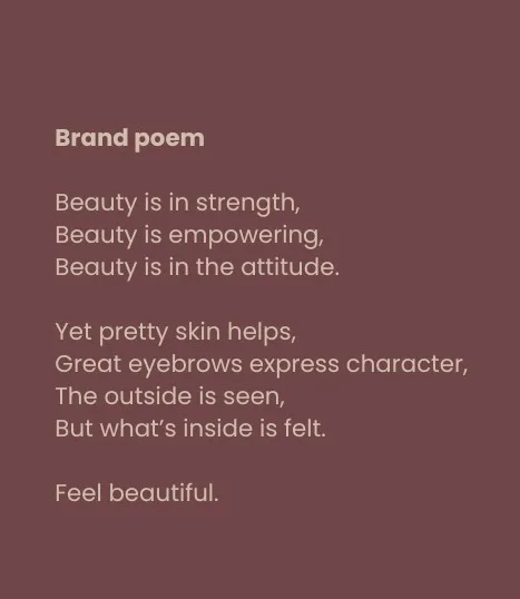
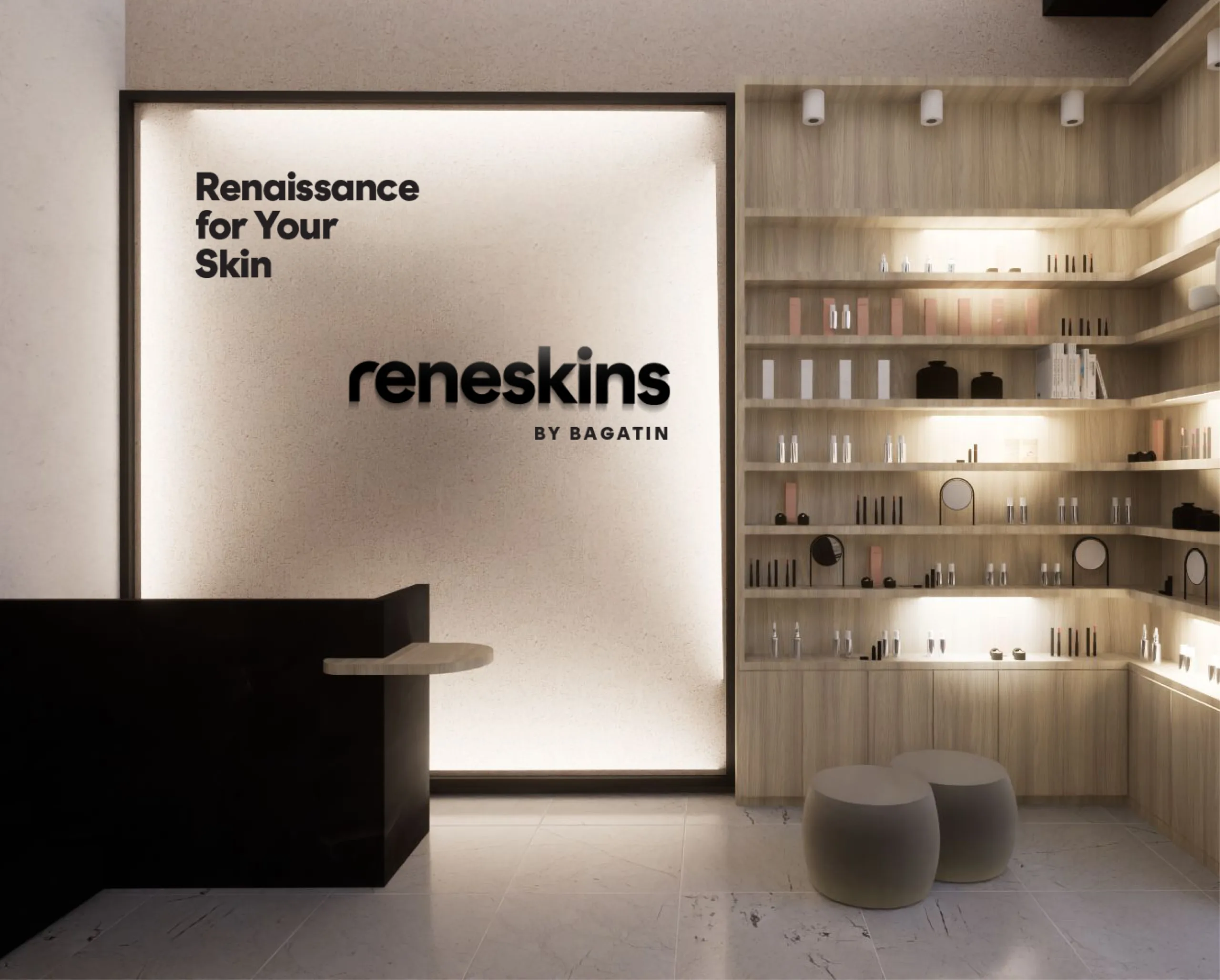
Reneskins is a coined name derived from renaissance and renewal — symbolizing rebirth — and skin, representing deeply renewed and revitalized skin. The slogan, “Renaissance for Your Skin,” echoes this promise of transformation. Alongside the slogan, we developed a brand poem and a set of key messages designed to evoke joy, satisfaction, and confidence.
Key messages
Shine with the Full Radiance of Your Beauty
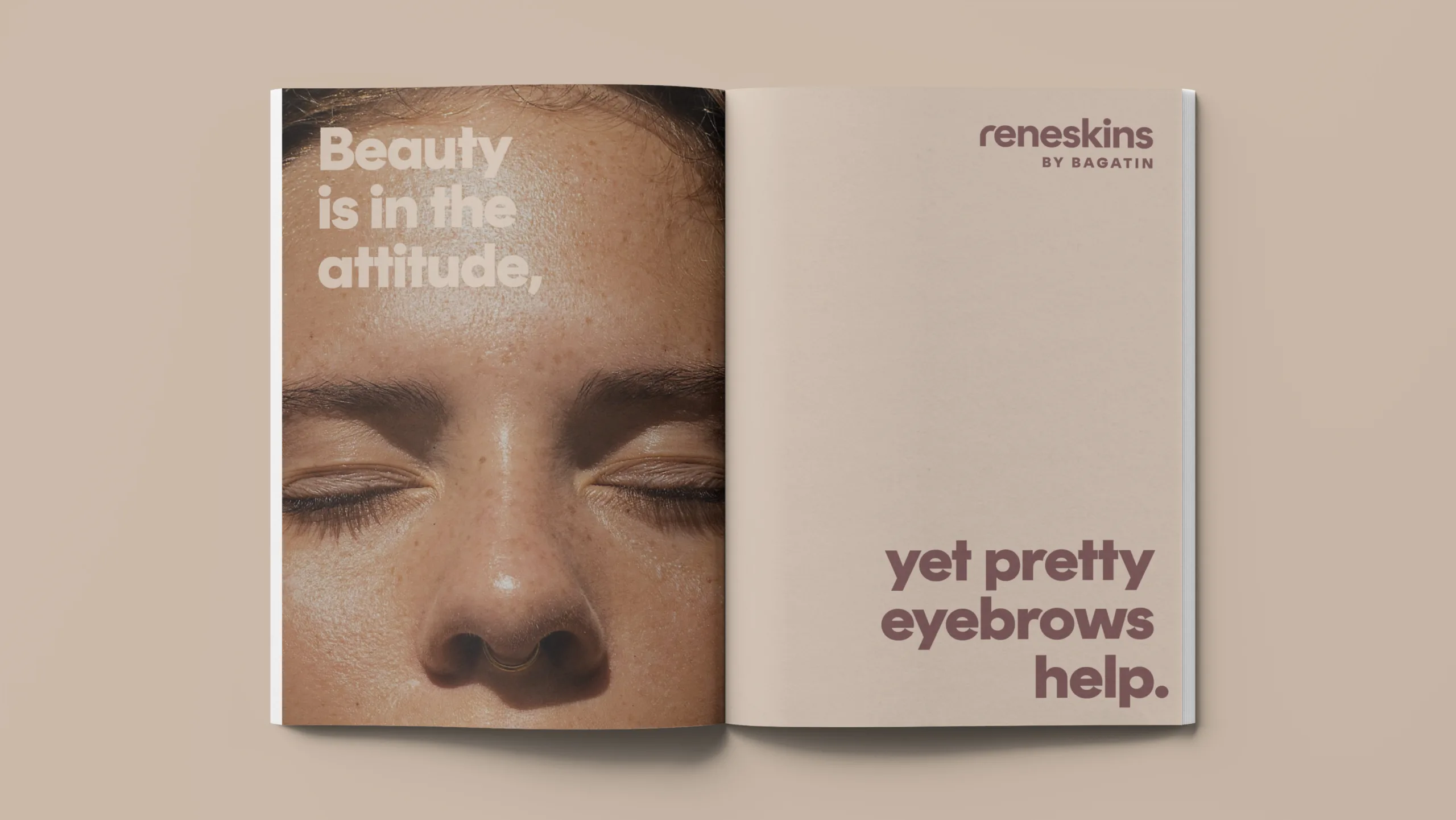
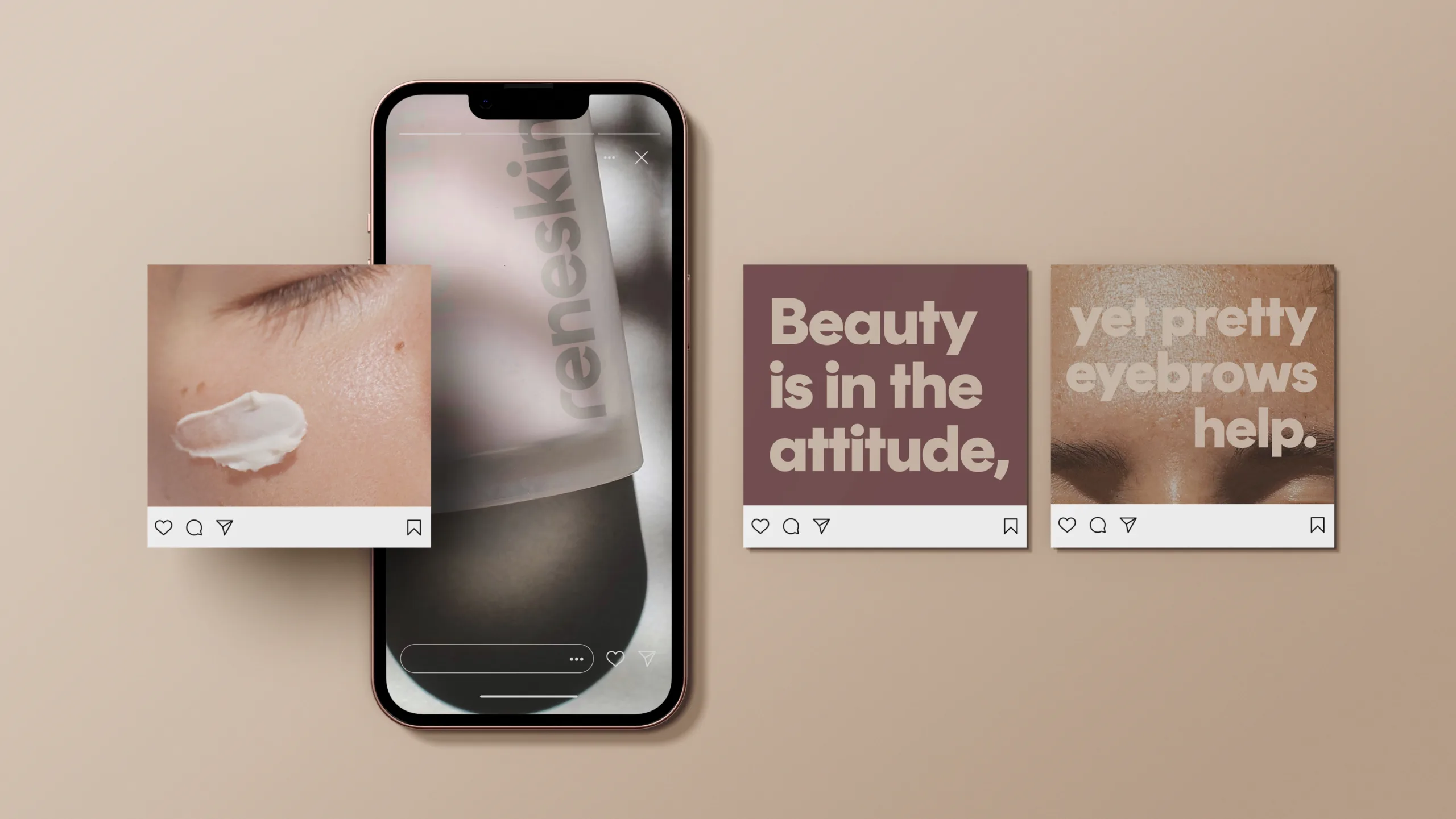
Great eyebrows express character
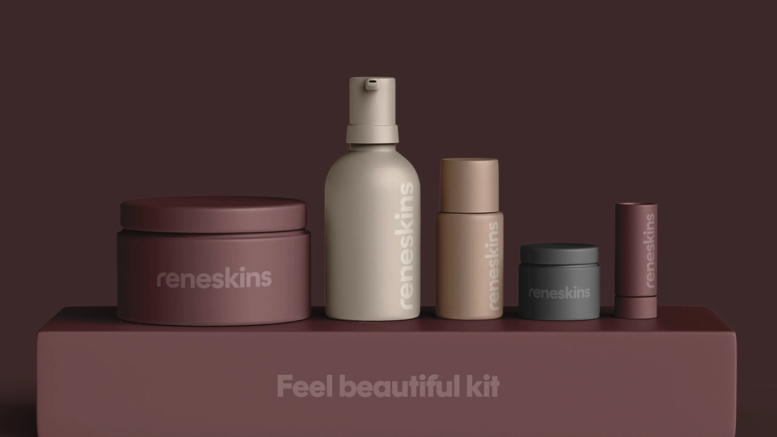
Feel beautiful
Beauty works
Beautiful attitude to life
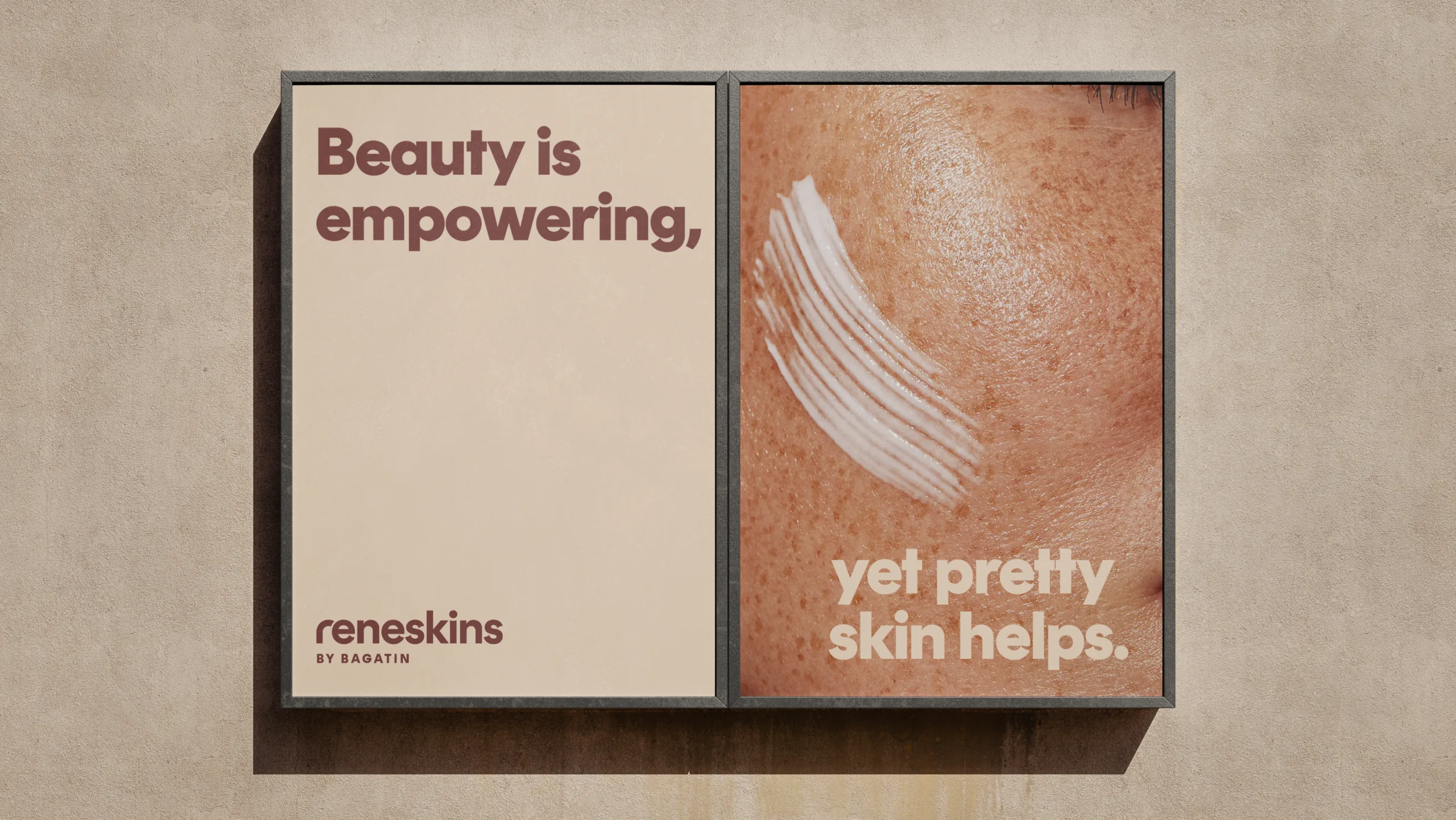
Don’t compare yourself to others. Just feel beautiful.
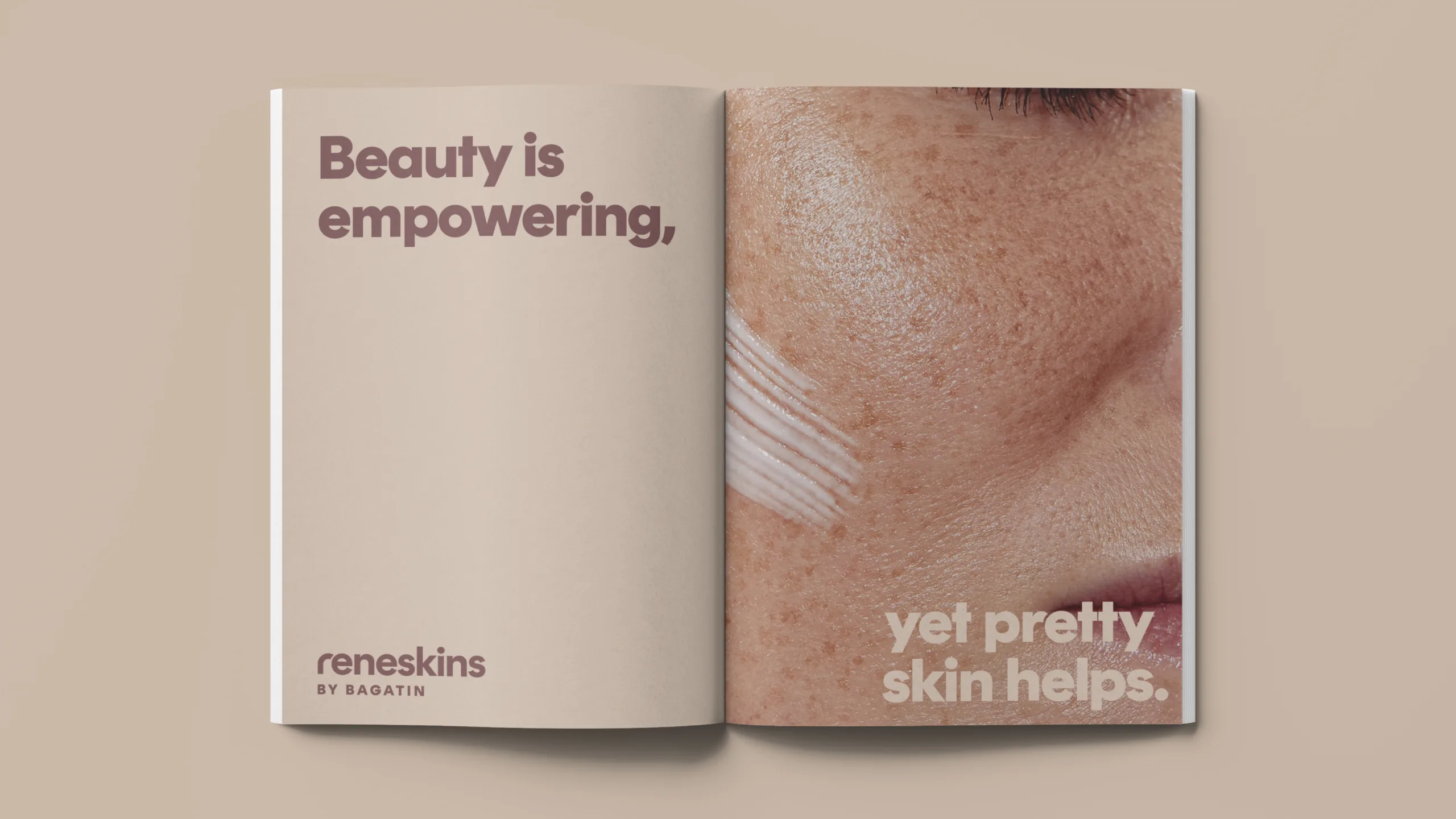
Beauty is in the attitude, yet pretty skin helps.
Visual Identity
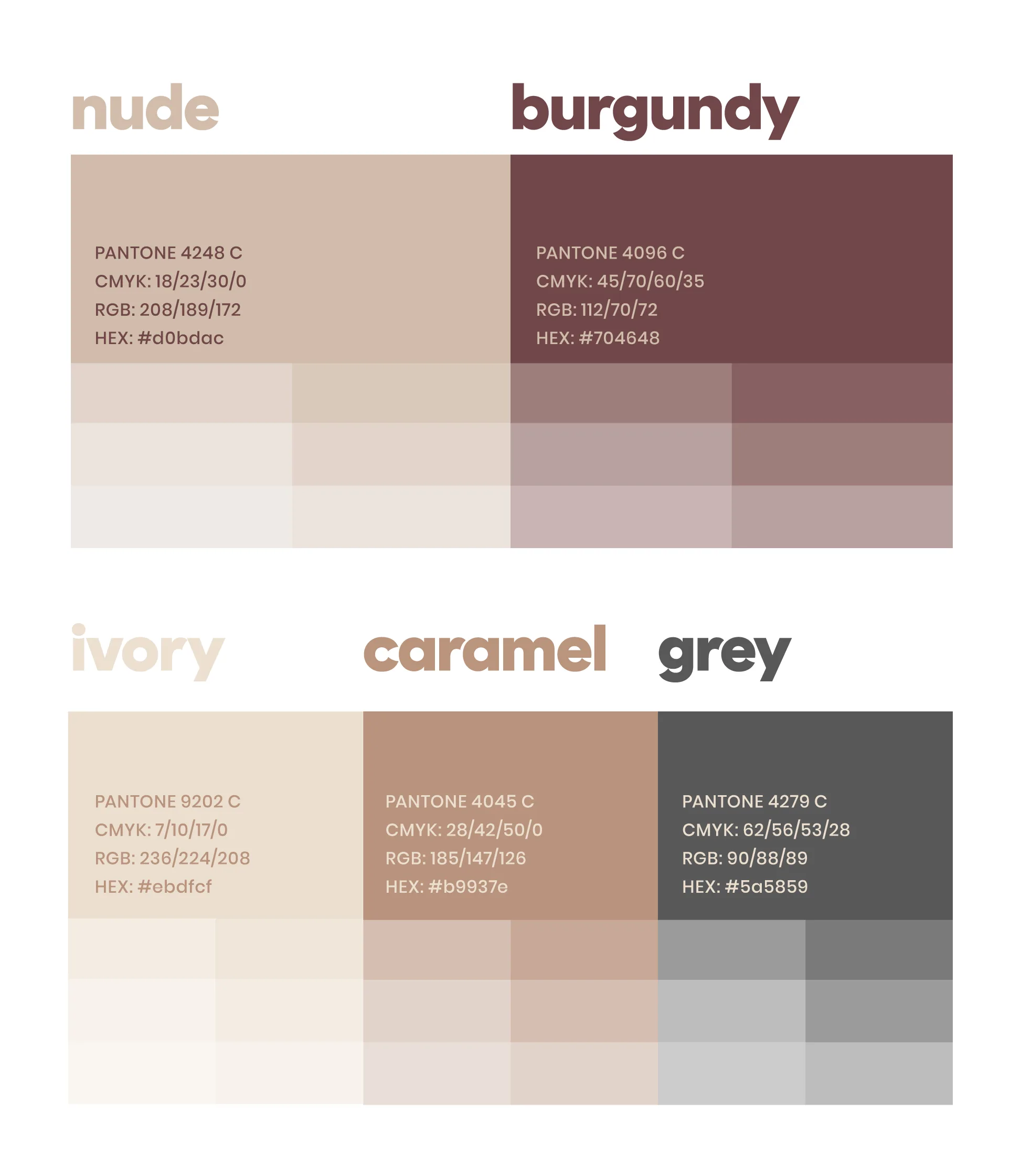
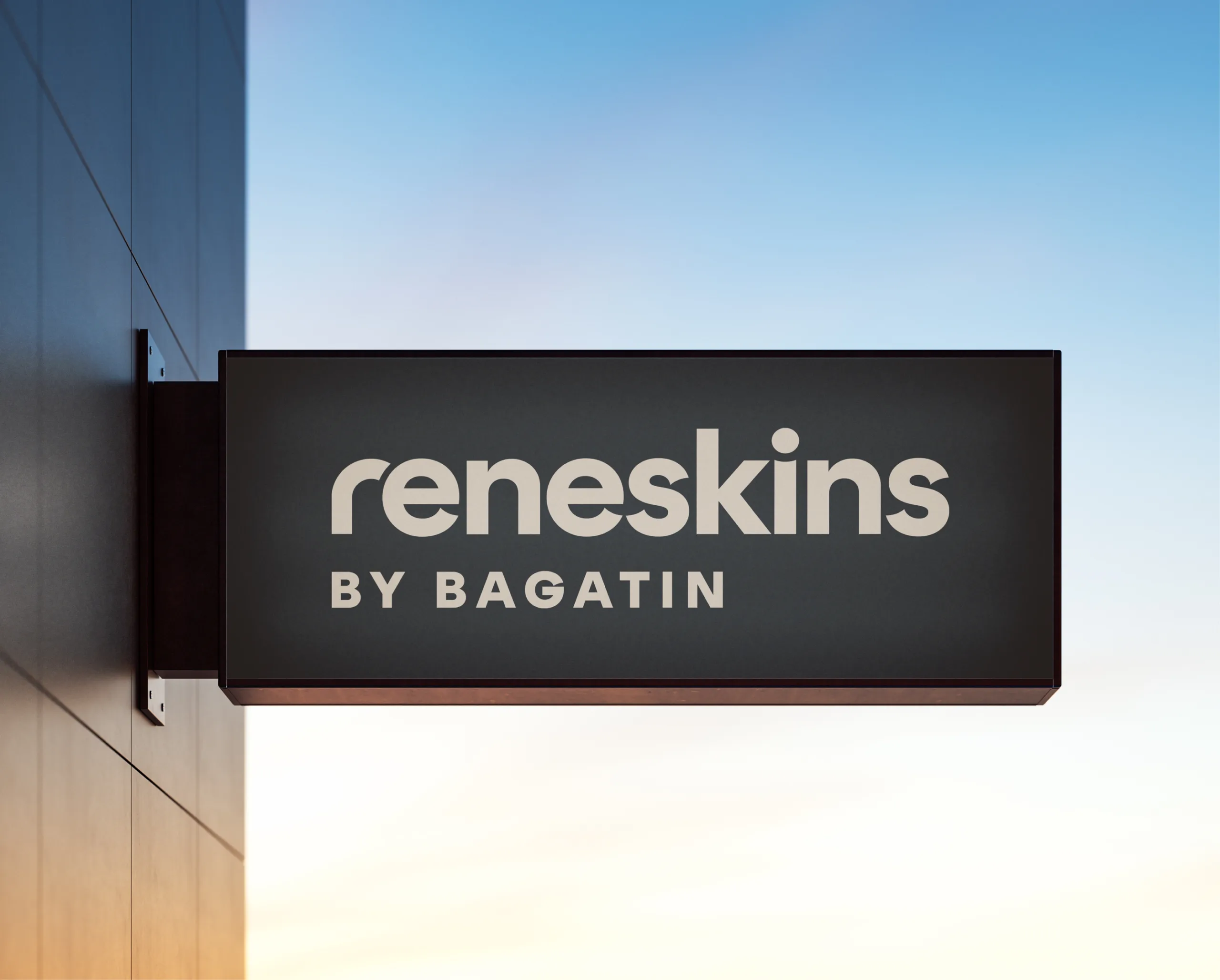
The logo is crafted in a modern sans-serif font with soft, rounded shapes — reflecting a refined sophistication and a contemporary approach to aesthetics and skincare. The brand symbol, a stylized letter “r,” serves as a central visual motif. It works both as a standalone graphic element and in various brand communication contexts — from packaging to digital media. The symbol’s smooth, elegant lines reflect care, gentleness, and sophistication. Its simplicity ensures strong recognition, while conveying professionalism and high-end aesthetics. The visual palette combines neutral and earthy tones — soft powdery shades and skin-like hues, accented by muted burgundy and warm grey. This color scheme evokes warmth, natural elegance, and luxury — aligning perfectly with the brand’s promise of commitment to beauty and skin health.
Brand Strategy & Creative Director: Anja Bauer
Naming Consultant: Anja Bauer
Copywriter: Anja Bauer
Senior Brand Consultant: Petra Despot Domljanović
Senior Brand Implementor: Jelena Mezga
Brand Consultant: Maja Đaković
Art Director / Designer: Tanja Pružek Šimpović