

Koristimo analitičke kolačiće kako bismo razumjeli korištenje stranice. Možeš prihvatiti ili odbiti. Više u Politici kolačića.
We created the brand strategy, name, slogan, and visual identity for Exelor, a travel agency specializing in congress tourism. For more than 25 years, they have been organizing congresses that bring together outstanding experts. Outstanding experts and a stimulating environment pave the way to excellence. Exelor itself strives for excellence in every detail and in the complete experience it provides to its clients, which forms the backbone of the brand story.

“Everyone needs a place that offers new knowledge, fresh insights, and different perspectives on work and expertise. Beyond being useful, such places can also be the setting for exciting experiences, because, as well as learning, we form new connections and deepen existing ones.
Excellence has a purpose: to enable everyone to fully dedicate themselves to their part of the work, while also enjoying the outstanding entertainment that is an essential part of our congresses. Every departure from the everyday is a step toward creating more powerful change.
Outstanding experts are essential to deepening excellence. That is why we are here to create a stimulating environment for socializing and exchanging ideas after long and informative lectures and workshops. We work on ourselves so that your work on yourself can be as successful as possible. Imagination and excellence drive profound change.”
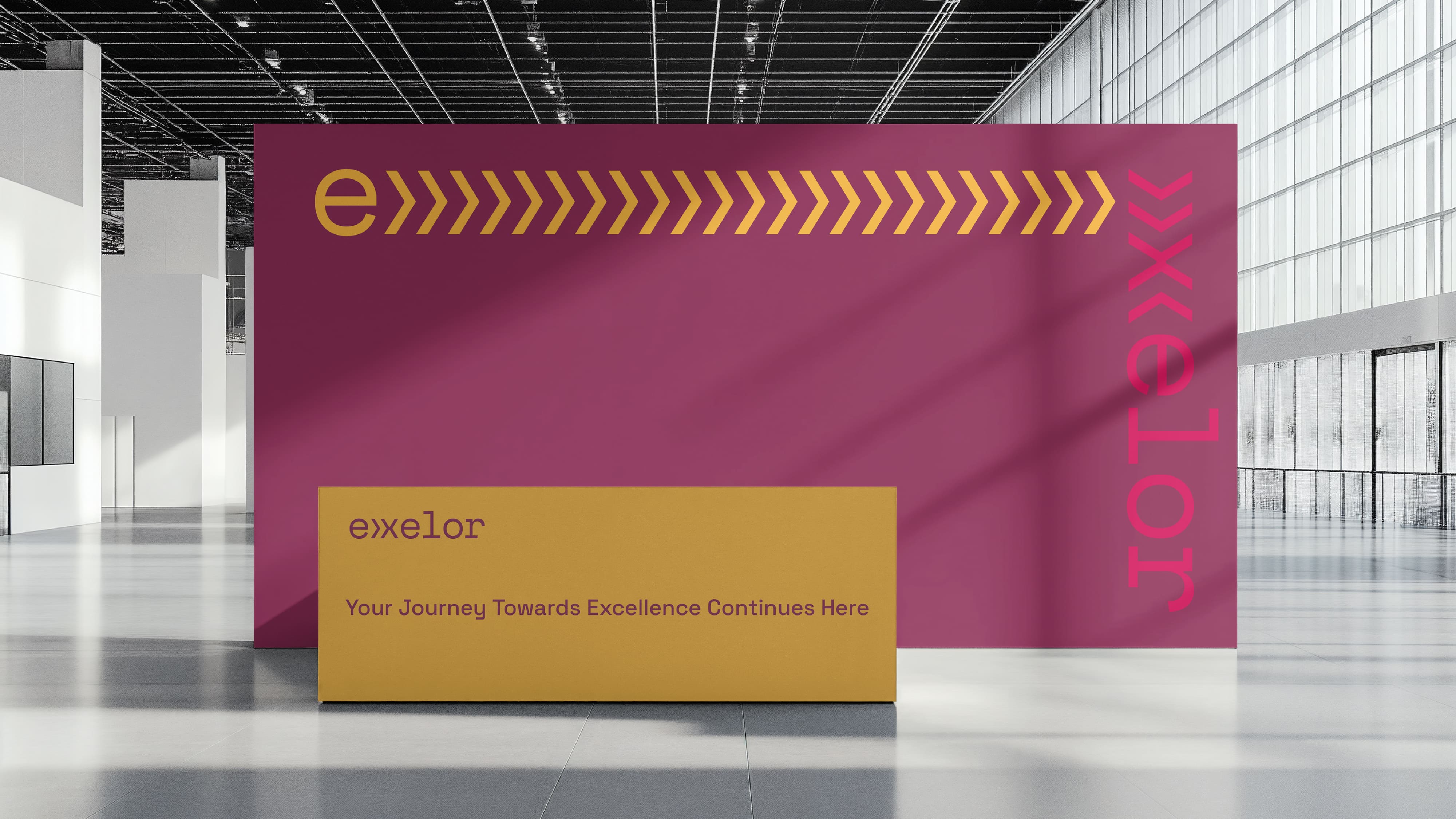
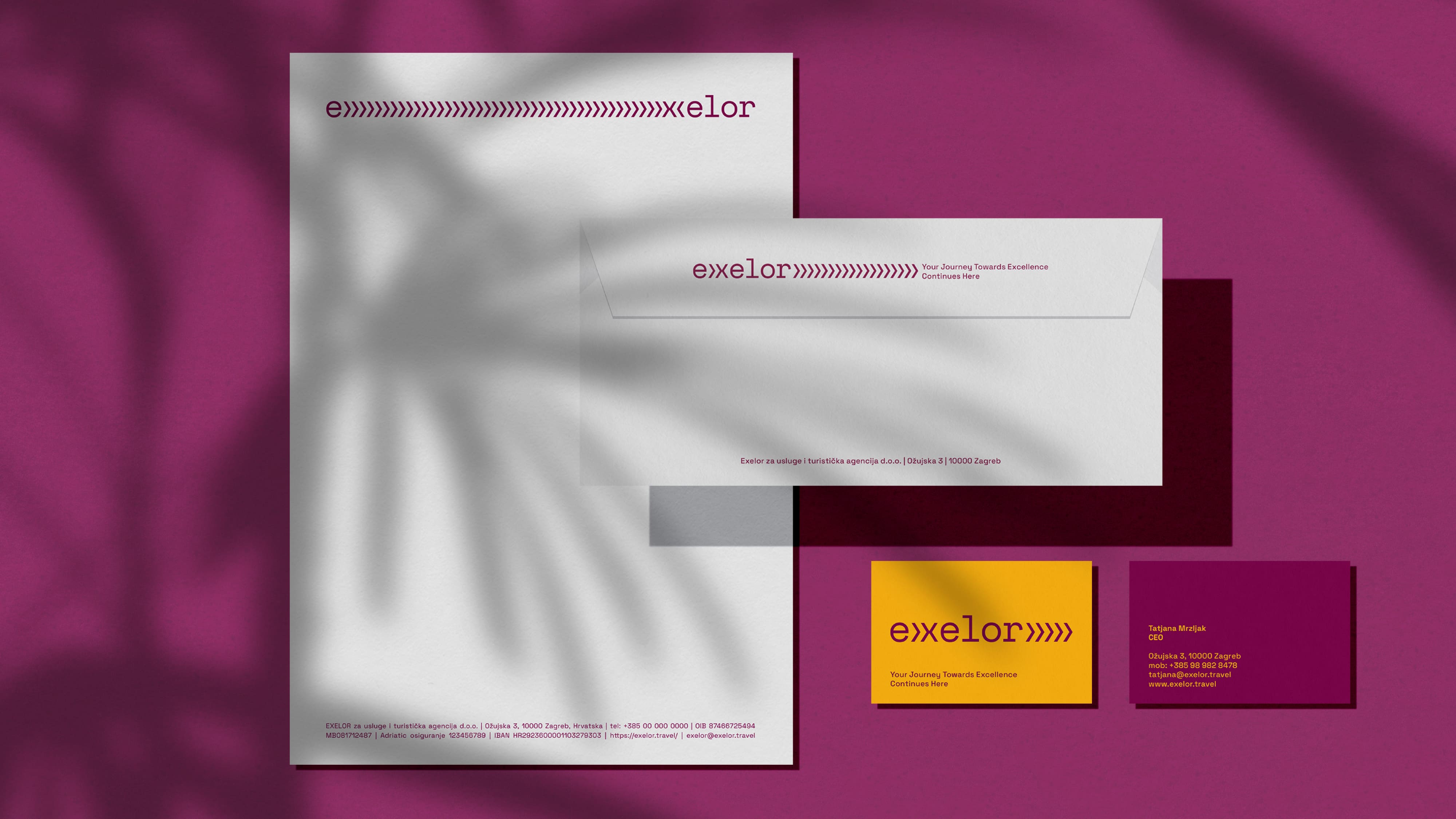
Exelor is a coined name derived from the English words expertise and excellence, as well as valor (value), and refers to congresses that deepen and foster excellence. This idea is also communicated through the brand slogan “Your Journey Towards Excellence Continues Here.”
We also created a series of key messages that communicate expertise and professionalism alongside an imaginative and personal approach, including: “Excellence and expertise drive success”, “Outstanding experts and a stimulating environment lead to excellence”, “Top level knowledge, exciting experiences”, “Stepping out of the everyday means stepping into profound change”, “Excellence, entertainment, excitement, all at once”, “You start green, you end up a G.O.A.T.” and “Feed the hungry mind with excellence and knowledge.”

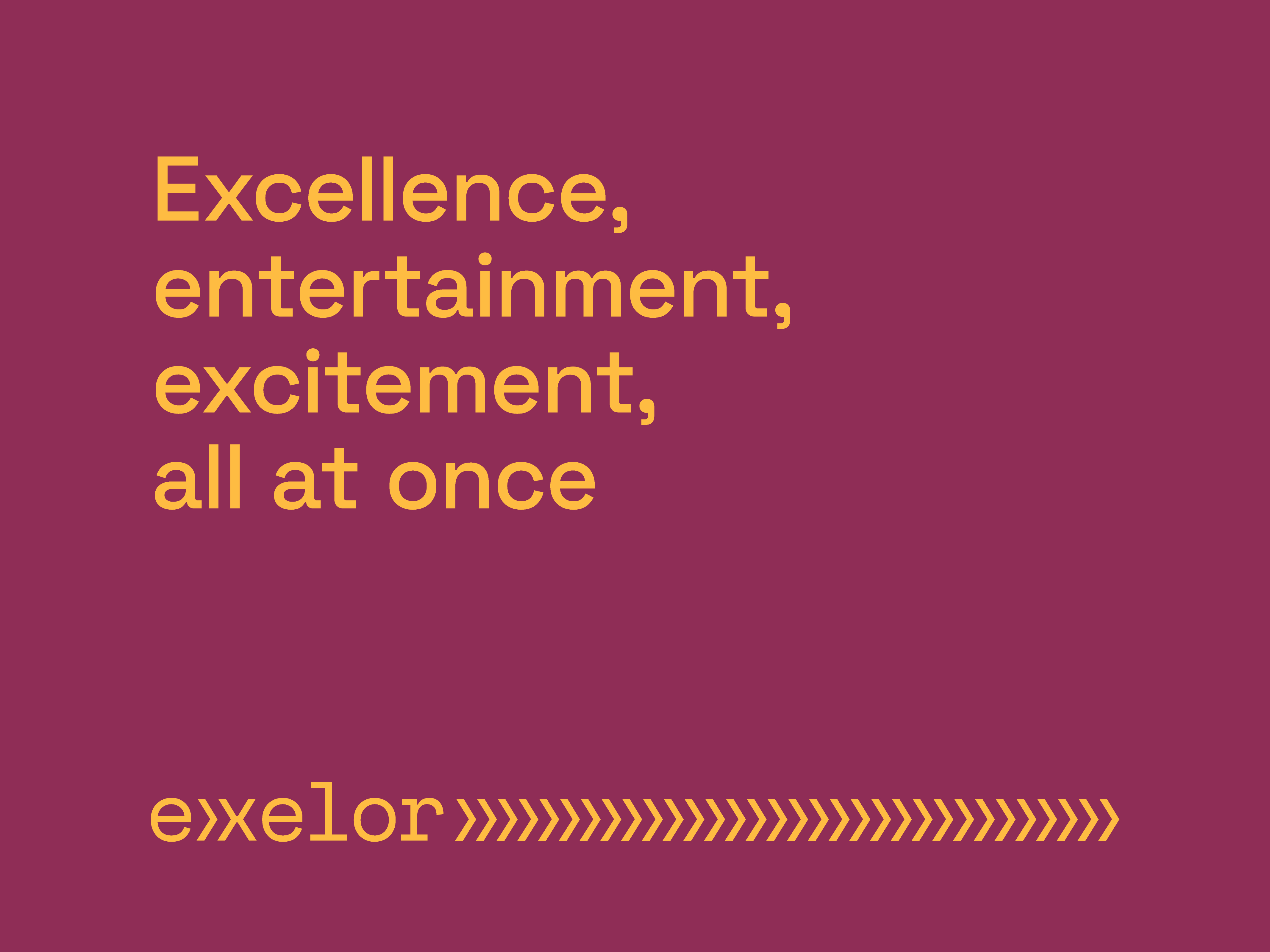
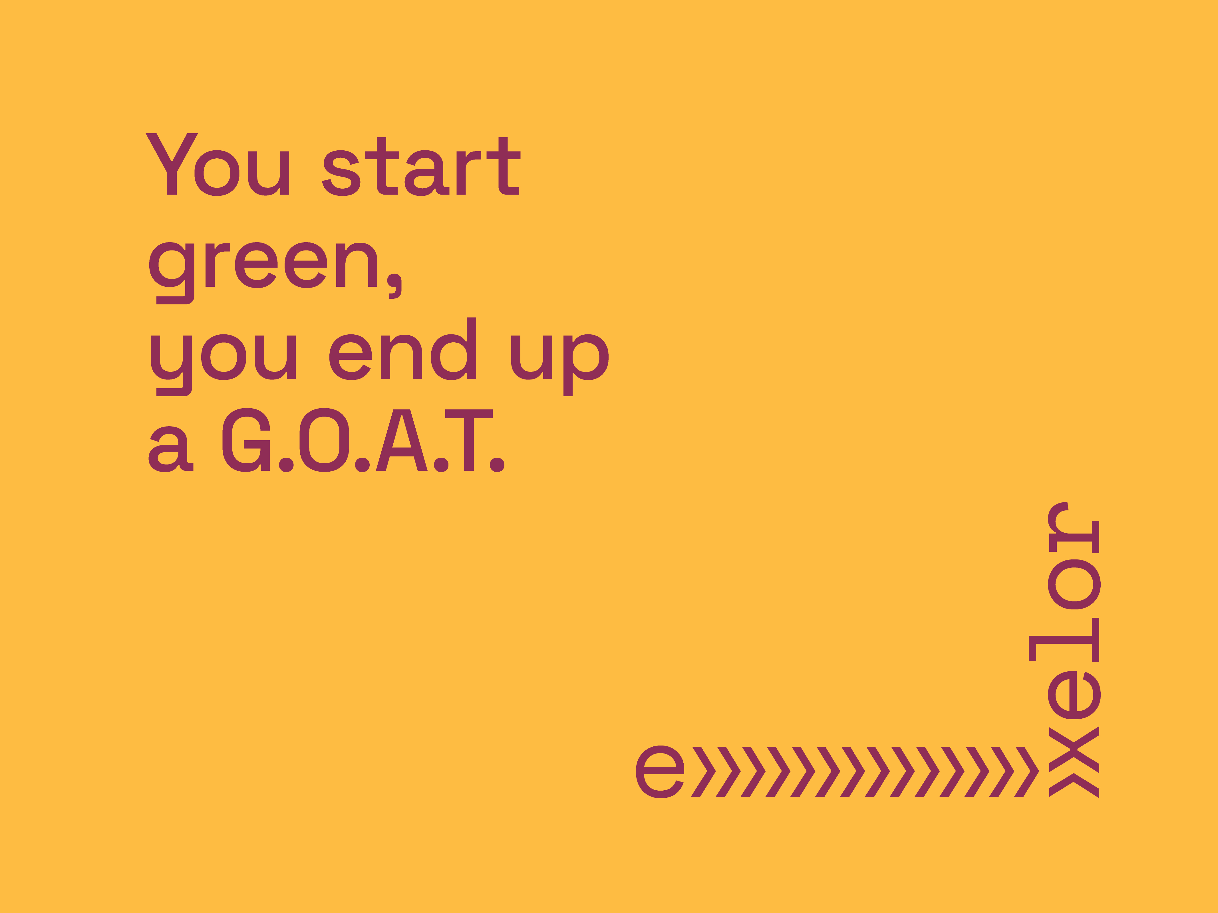


The key motif of the visual identity is a series of stylized arrow like symbols (»), which gradually transform and integrate into the typography. This element symbolizes the process of learning, exchanging ideas, and professional development at congresses. The logo is modular and functions as a visual narrative. The arrows are a metaphor for journey and progress, the typography reflects expertise and stability, while the composition represents continuous development.
Brand Strategy & Creative Director: Anja Bauer
Naming Consultant: Anja Bauer
Copywriter: Anja Bauer
Head of Brand Strategy: Petra Despot Domljanović
Senior Brand Implementor: Jelena Mezga
Senior Brand Consultant: Maja Đaković
Brand Experience Consultant: Petra Crnički
Brand Experience Creator: Ella Katherine Orešković
Art Director / Designer: Tanja Pružek Šimpović
Web Design: Roberta Cindrić
Motion Graphics: Andrej Todorovski, Rudi Bauer

