

Koristimo analitičke kolačiće kako bismo razumjeli korištenje stranice. Možeš prihvatiti ili odbiti. Više u Politici kolačića.

ZigZag is the leading company in the apartment rental industry in SE Europe. From just a couple of apartments in the center of Zagreb, during the years they have developed into strong starter of the market with more than 200 apartments in 6 European cities – Zagreb, Split, Rovinj, Dubrovnik, Beograd and Vienna.
They decided to rebrand themselves to become more modern for today’s consumer, and strengthen themselves for the future. The rebranding was led by the brand insight about the consumers – they want to freely explore a foreign town, city or any place yet feel safe and comfortable each time they return to their new “home”. The apartments are located in the very heart of the city amidst the city’s most prominent sites.
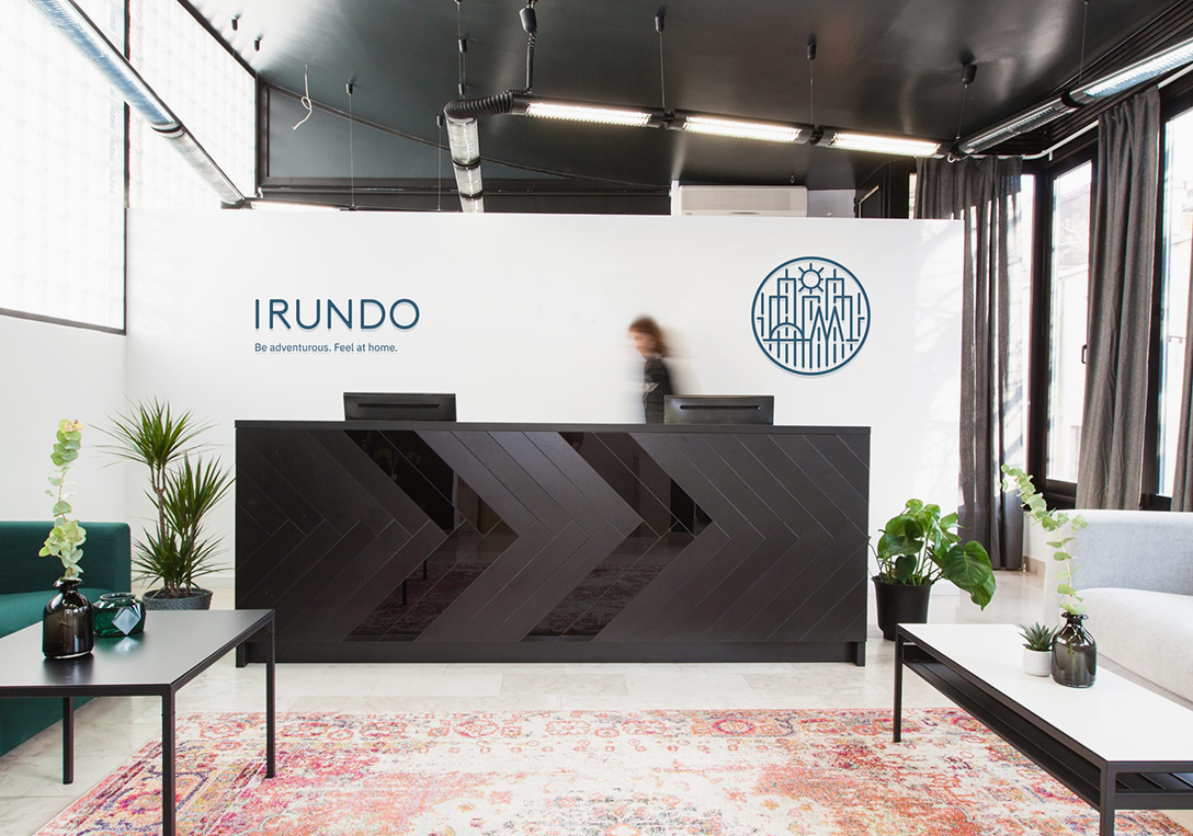
The insight guided us in creating the new brand name and slogan. We named the brand after the swallow (in Latin hirundo), a migratory bird which always returns home to its nest, and it can also be pronounced as I-run-do because we always want to encourage you to go out and get to know the city through the eyes of its residents. Along with the brand name, we have created the brand slogan "Be adventurous. Feel at home". It communicates the very essence of the brand.
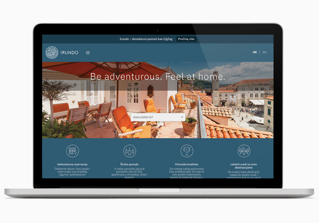
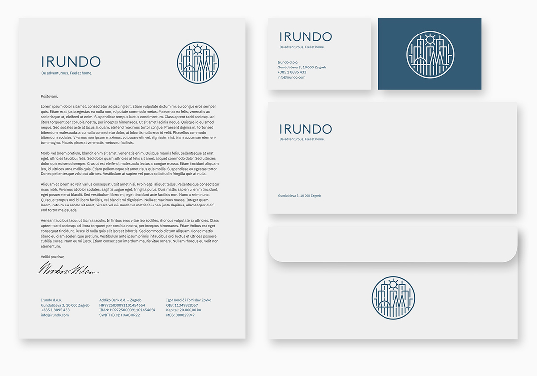
For the new visual identity credits go to art director Igor Manasteriotti. Through the illustration of the city, this visual identity portrays the adventure of exploring new places. In the middle of the sign there is a hidden letter “i” which symbolizes the key strength of the brand – central location of all of its apartments. The round and symmetric sign represents the stamp of quality and further encourages the feeling of security and trust.
Brand Strategy & Creative Director: Anja Bauer
Senior Brand Consultant: Petra Despot Domljanović
Brand Consultant: Stipan Rimac
Naming Consultant: Anja Bauer
Brand Implementor: Jelena Mezga
Art Director / Designer: Igor Manasteriotti, Manasteriotti DS
Photographer: Saša Ćetković
