Koristimo analitičke kolačiće kako bismo razumjeli korištenje stranice. Možeš prihvatiti ili odbiti. Više u Politici kolačića.
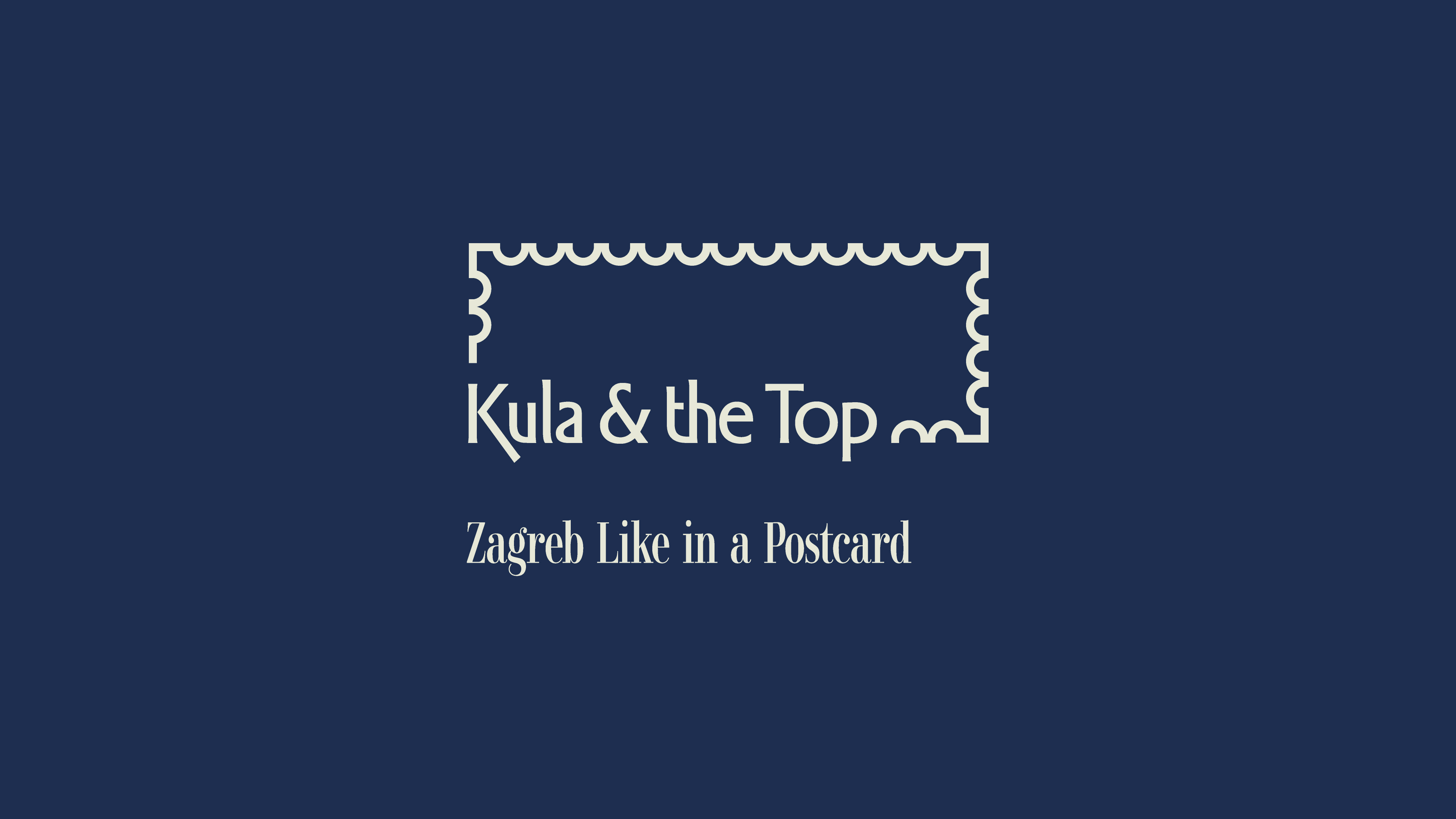
We created the brand strategy, name, slogan, and verbal and visual identity for Kula & the Top, a new aparthotel located in Tomićeva Street in Zagreb. Kula & the Top inspires guests to create perfect, unforgettable moments in the city.
Tomićeva Street is one of Zagreb's most photogenic streets. It is where the city's first photograph was taken and where many iconic postcards of Zagreb were created. Just steps away from the hotel stands the Lotrščak Tower, one of Zagreb's best-known landmarks, alongside countless unexpected places that will make you want to become part of Zagreb's postcard.
"Tomićeva Street was once known as Bregovita, or Berggasse. The moment you turn into Tomićeva, you step into another time. Into a different reality where life moves at a slower pace, where traditional desserts and fine cuisine, refined perfumes, and local souvenirs await around every corner.
The cobblestone street evokes memories of the past. It is striking, photogenic, and steeped in history. Walking here feels entirely different from strolling along nearby Ilica; you experience Zagreb's history more intensely. A deeper, stronger feeling of the city.
Tomićeva Street embodies Zagreb's resilient and resourceful spirit. It has always been a place where people created, where life was colourful and different. That creative energy is still present today, reimagined by new generations who bring authenticity to everyday life in Zagreb. The street's photogenic charm has been recognised for more than a century. Artists captured Zagreb's most memorable postcards here because it truly is special. Purger special."


The name Kula & the Top carries a double meaning. It refers to two of Zagreb's best-known landmarks, the Lotrščak Tower (Kula Lotrščak) and the Grič Cannon (Grički top), while the top also signifies an exceptional stay and top-tier experiences.
The hotel's vibrant surroundings and the unexpected discoveries waiting around every corner create an unforgettable image of Zagreb, perfectly reflected in the brand slogan Zagreb Like in a Postcard.
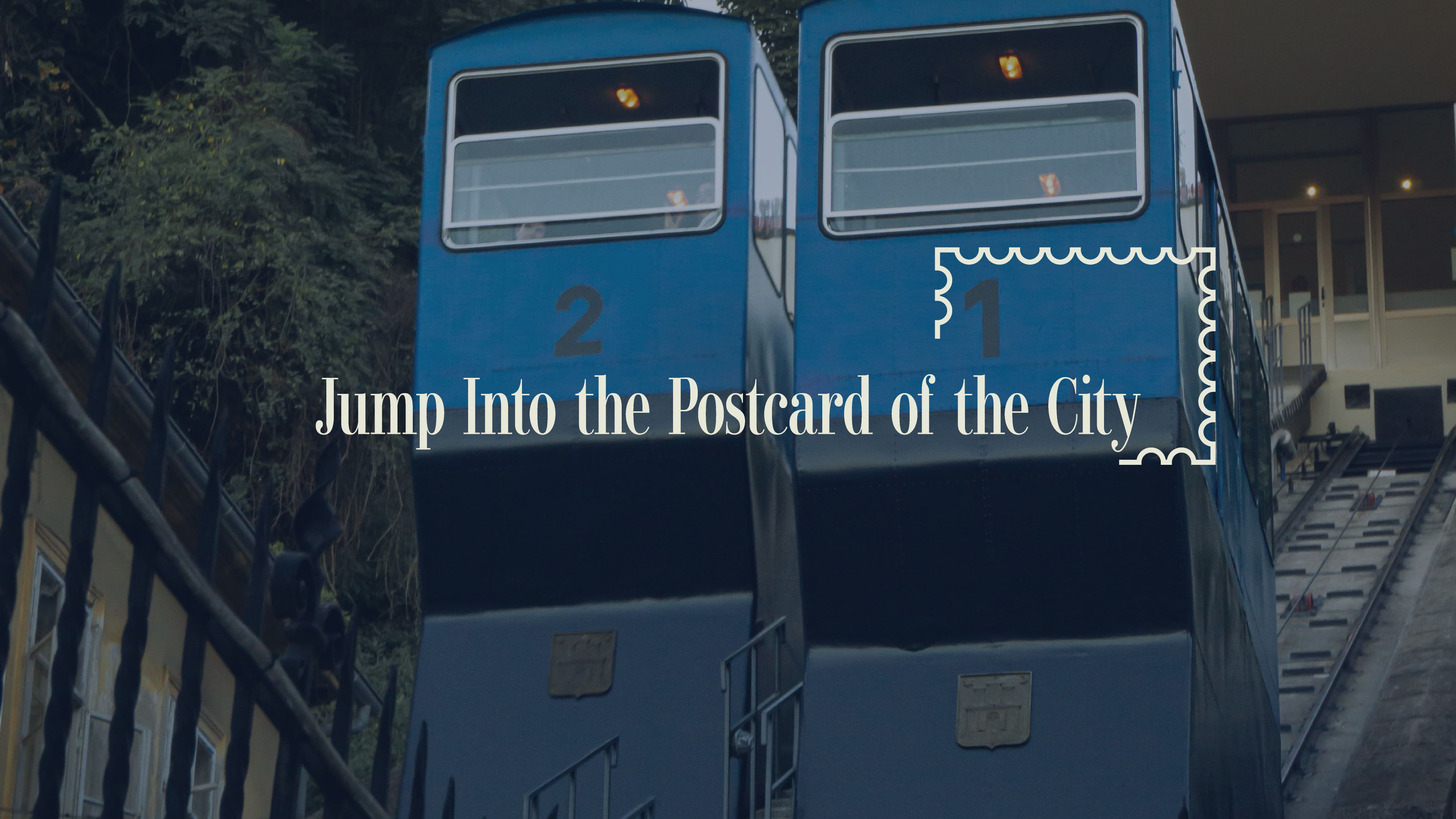
Alongside the slogan, we developed a series of key brand messages that invite guests to discover Zagreb's rich history while experiencing its vibrant everyday life, including Jump Into the Postcard of the City, Greetings from Zagreb, Be a Part of Zagreb's Postcard, Feel Like You're in the Postcard, Unexpected Expectation, Monotony Does Not Exist, and Purger Special.
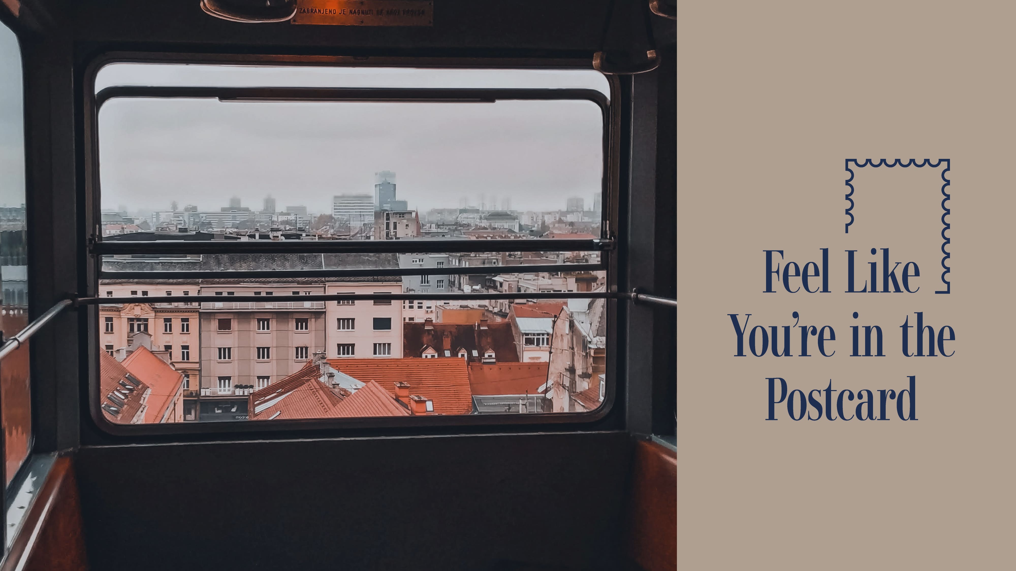
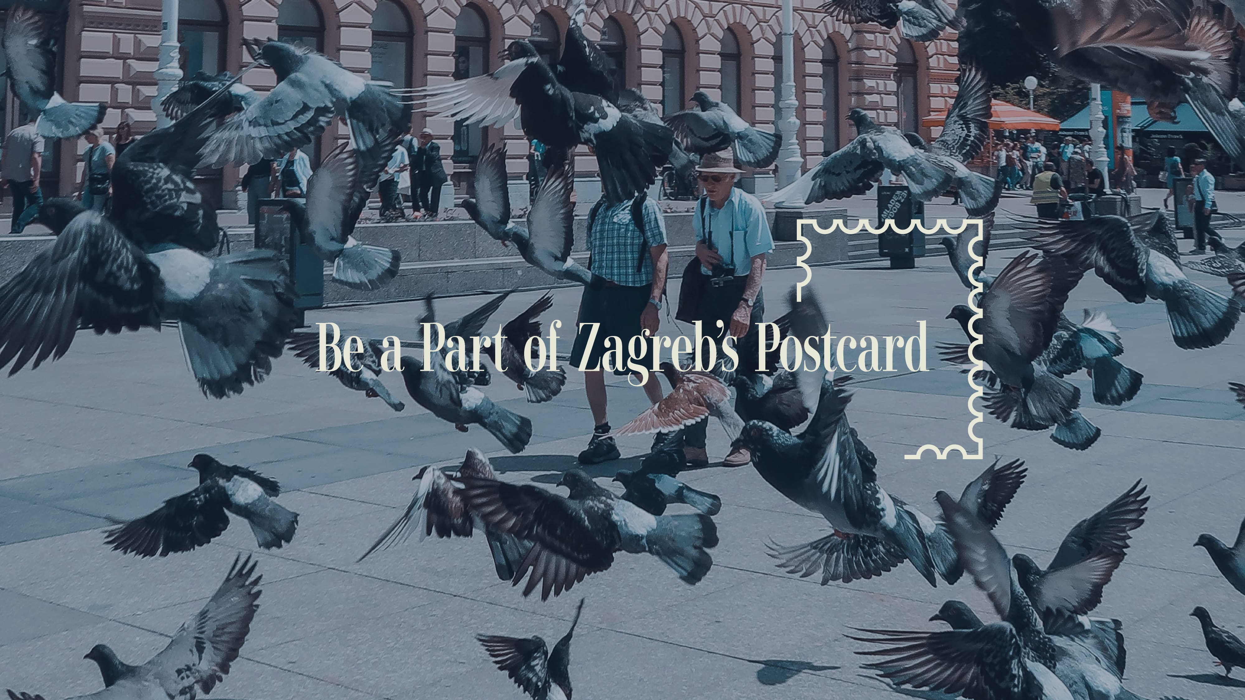

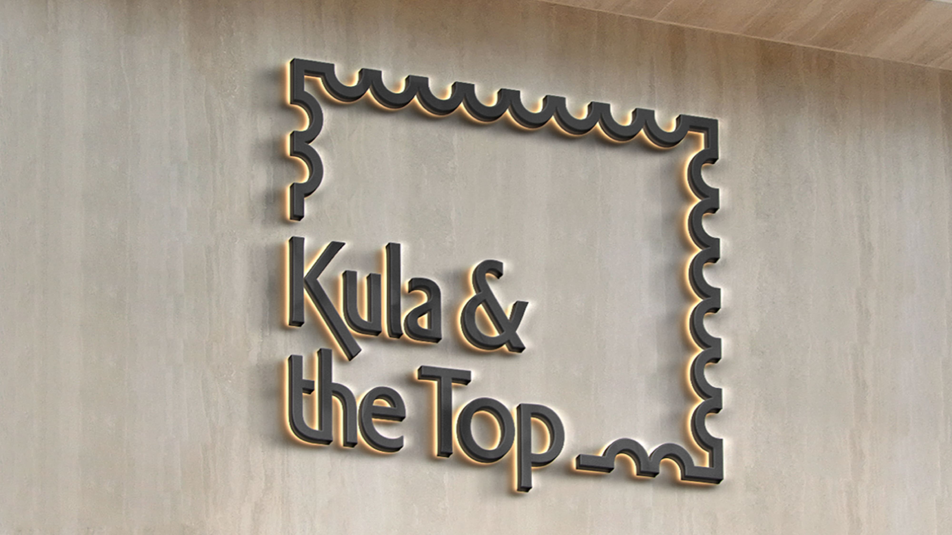
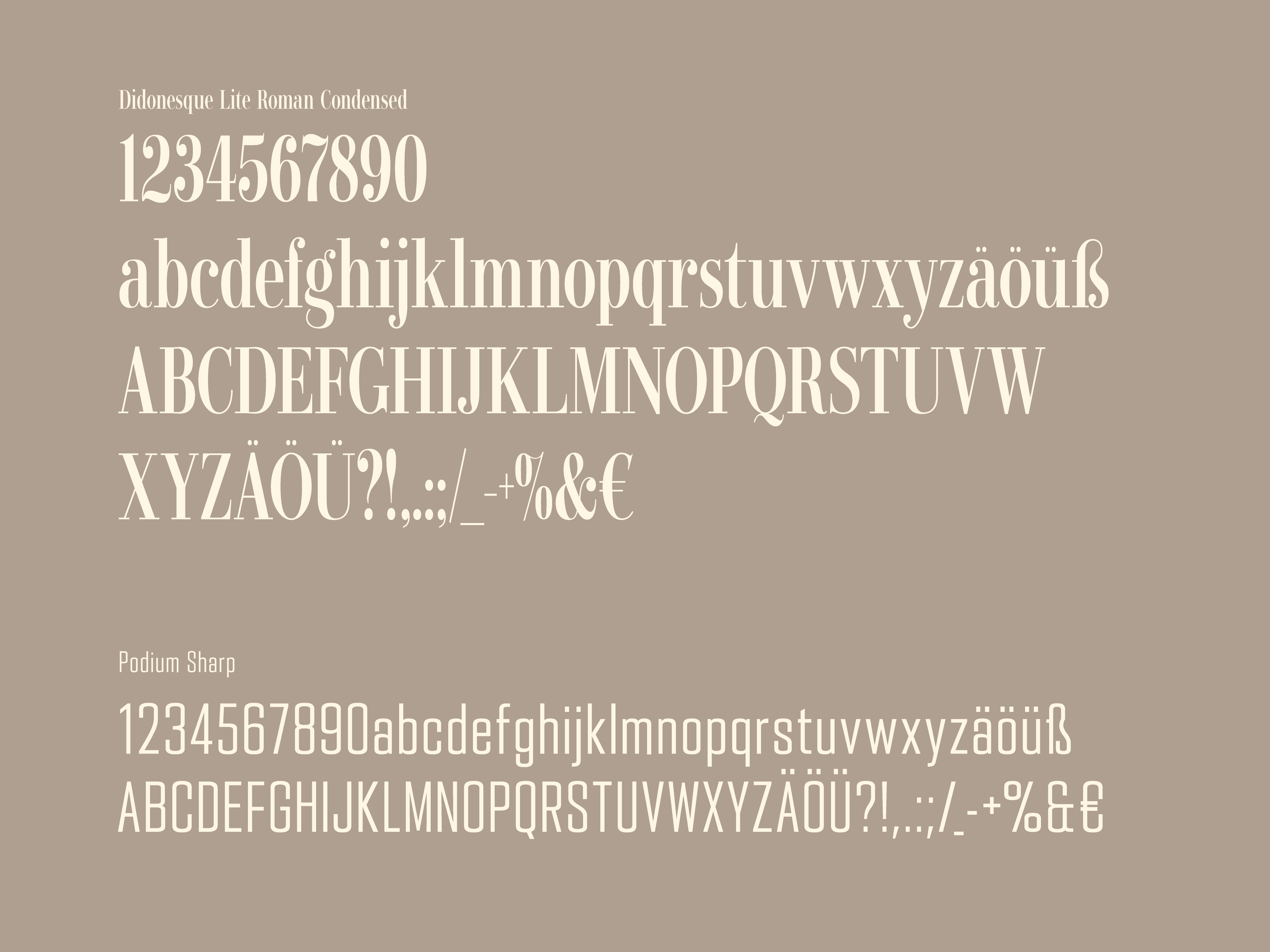
The visual identity draws inspiration from vintage postage stamps and postcards of Zagreb. The logo features a simple linear outline of a postage stamp that also resembles a window frame. Looking through this frame, guests experience Zagreb's unique character as if viewing a postcard. Modern, elegant typography reflects the city's urban atmosphere while hinting at the unexpected experiences waiting to be discovered.

Brand Strategy & Creative Director: Anja Bauer
Naming Consultant: Anja Bauer
Copywriter: Anja Bauer
Head of Brand Strategy: Petra Despot Domljanović
Senior Brand Implementor: Jelena Mezga
Senior Brand Consultant: Maja Đaković
Art Director / Designer: Tanja Pružek Šimpović
Motion Graphics: Rudi Bauer