
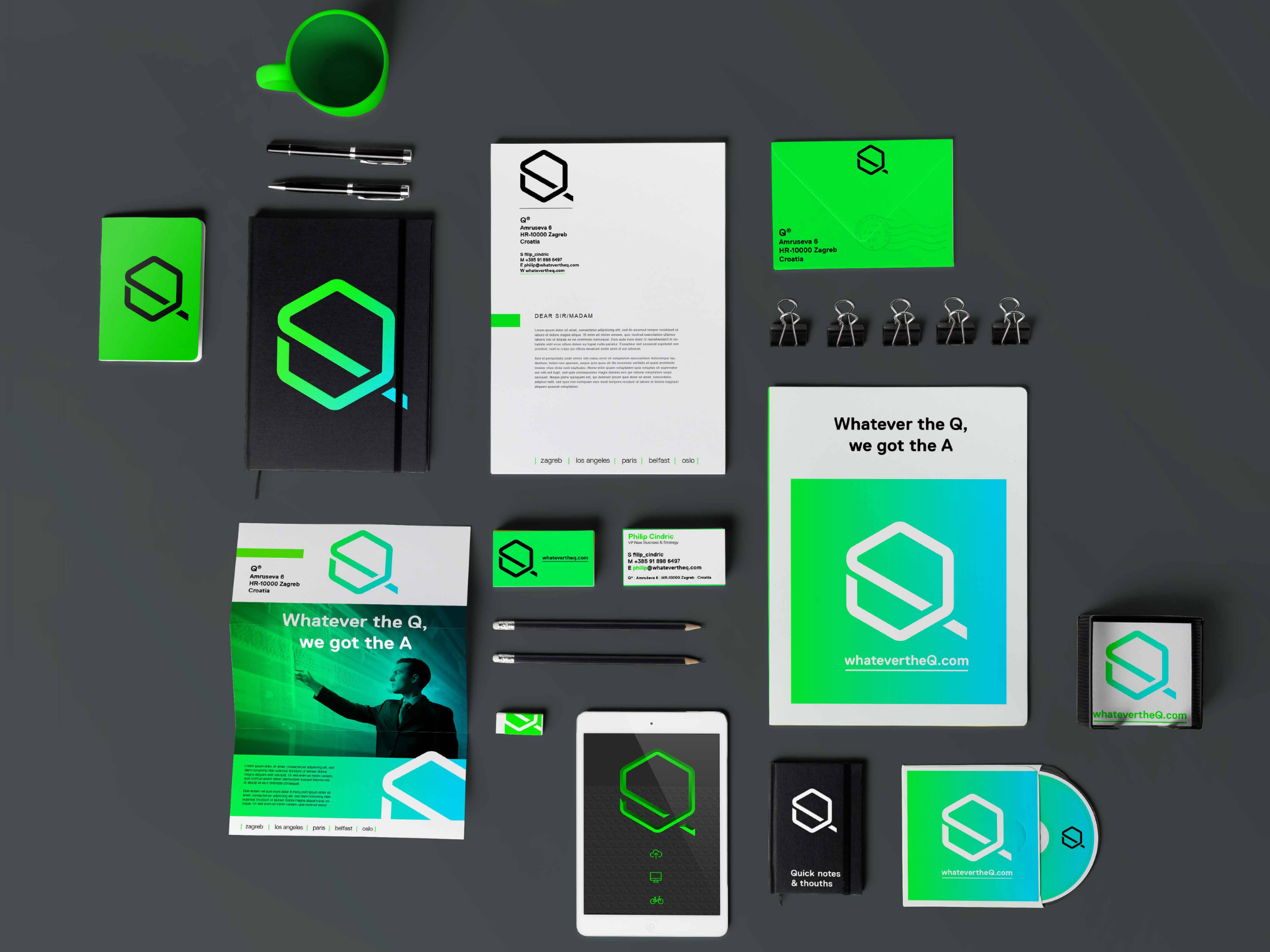
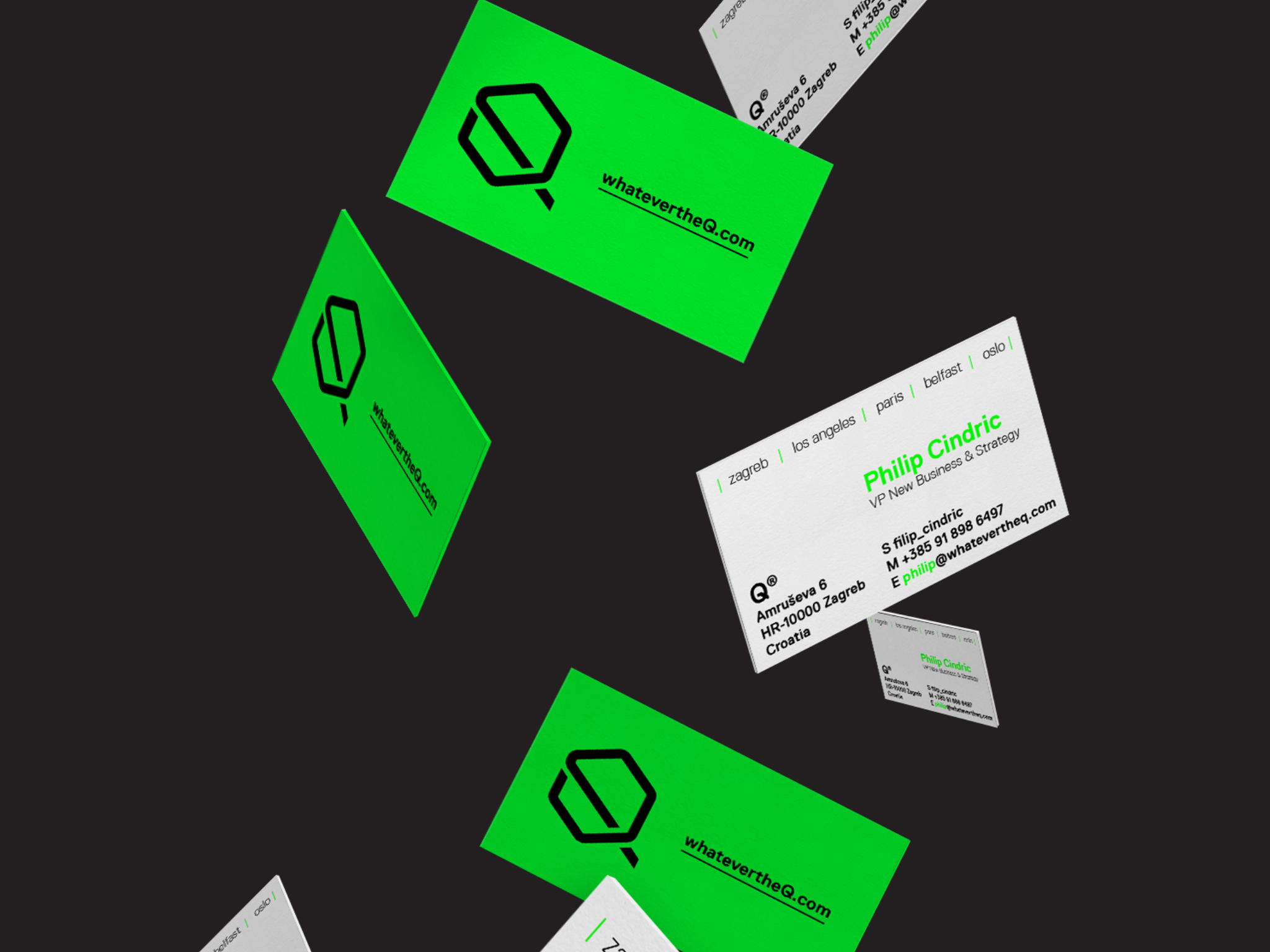
Q is one of the fastest growing IT companies in Central Europe, operating through five global offices in Los Angeles, Belfast, Paris, Oslo and Zagreb HQ. Despite its incredible growth, Q’s brand was vague because the name didn’t mean anything and the visual identity was outdated.


The brand strategy defined what Q means. The meaning was defined according to Q’s strengths – their expertise and experience to answer even the hardest questions. Q’s answers bring about positive change. This was the foundation of the meaning of the brand. Q is a question, a question that will be answered, therefore their brand essence became their slogan: “Whatever the Q, we got the A.”

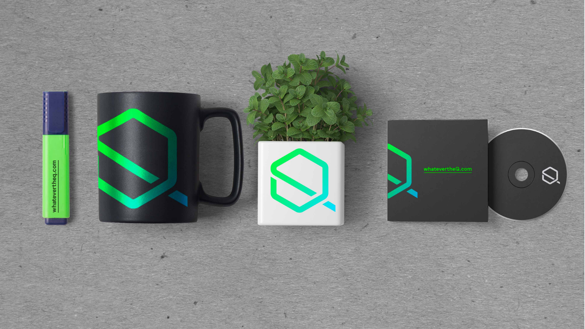
The visual identity embodies the brand essence. Its enlightening colors have been used to communicate the modern vibe of the brand. And the letter Q shows both Q and A. Both are presented in the logo, the letter A is visualized inside the Q because ‘whatever the Q we got the A’.
Brand Strategy & Creative Director: Anja Bauer
Senior Brand Consultant: Petra Despot Domljanović
Brand Consultant: Stipan Rimac
Copywriters: AnjaBauer
Brand Implementor: Jelena Mezga
Art Director / Designer: Siniša Sudar