Algebra
Algebra is the leading private education institution in Croatia. More than 15,000 students attend its educational programs annually. From the beginning, Algebra has been synonymous with the first class education in the field of digital technologies, but due to its strong development and growth, the brand has faced several, major challenges.
The key challenge was to solve the company’s unclear brand architecture. Algebra was visually divided into two extensions, the “blue” that referred to higher education and the “orange” that concerned adult education programs. This visual division resulted in an internal division as well, which caused further problems in the launching of new products and new acquisitions.

Each new program was communicated as an independent unit without Algebra’s endorsement. The result was often vague and uncertain messaging. What’s more, Algebra’s brand stood in contrast to all the trends followed by all other major universities in the world because it combines all programs, from undergraduate to lifelong learning, under one roof brand.
In order to empower Algebra and give the brand a clear meaning, we introduced the Branded House model of brand architecture where all of Algebra’s extensions and programs were united under one umbrella brand. We created a striking emotional story that is equally relevant to all of Algebra’s target groups – from elementary school students attending Algebra’s digital academy, through college students, to participants in Algebra’s lifelong learning programs.
The backbone of our story is to inspire Algebra’s students to discover what they love to do and to excel in doing it. In one word, we call this process “spark” because the idea of lighting the spark contains emotion and an association with intelligence, light, and the desire for excellence. This is further highlighted by the new slogan: “Be excellent at what you love doing. Light the spark.”
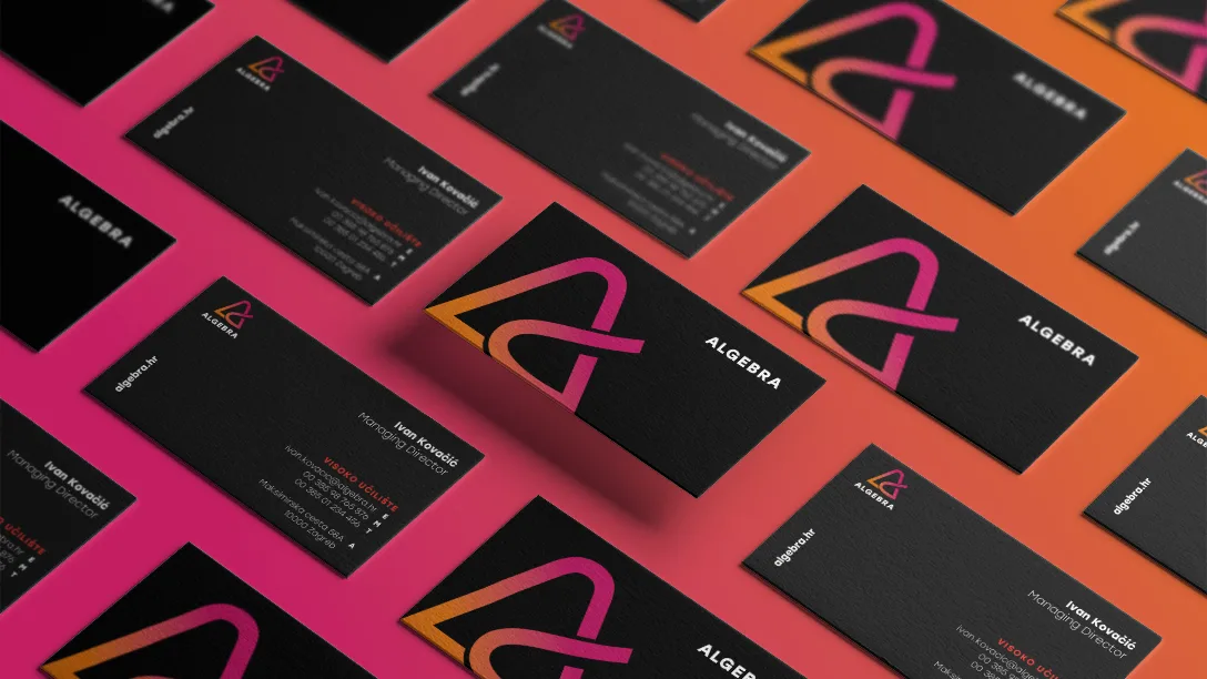
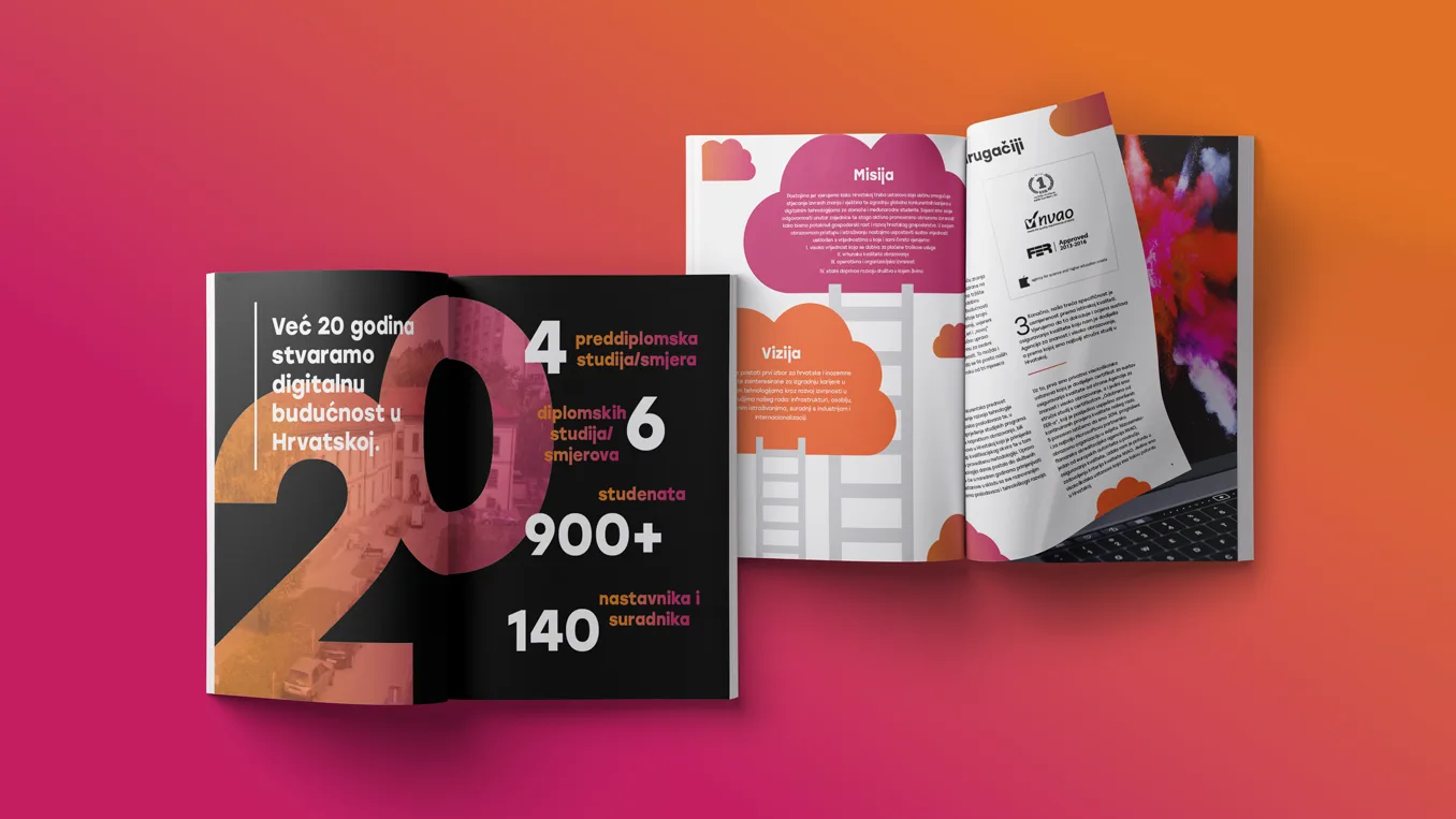
Based on this brand strategy, Studio Sudar has created a new visual identity for Algebra. The logo represents a stylized letter A that reminds us of the pages of an open book, symbolizing learning, continuous growth and progress, and because of its color, energy, passion and spark. The new visual identity has been creatively applied to a variety of applications and to the interior of the campus, thus reviving the brand.
With its programs, new communication, and identity, Algebra encourages us all to discover what we love to do, excel at it, and light the spark.
Brand Strategy & Creative Director: Anja Bauer
Senior Brand Consultant: Petra Despot Domljanović
Brand Consultant: Stipan Rimac
Copywriters: Anja Bauer
Brand Implementor: Jelena Mezga
Art Directors / Designers: Siniša Sudar, Žana Mrša
 Back
Back
