Ilks is the first Croatian brand of silk bedding for which we created the name, slogan, visual identity, and brand strategy.
Silk has always been considered an exclusive and expensive material due to its rarity and craftsmanship needed for its production. What is less known are the benefits silk offers to skin and hair. Research shows that silk is full of natural amino acids, helps regenerate and conserve moisture for skin and hair, repels UV rays, has strong antibacterial and antistatic properties, and is very effective in repelling mites.
These elements led us to realize that when you aren’t doing anything, you may be doing a lot for yourself. This gave rise to a new brand story.
When I don’t do anything, I do a lot for myself, for my inner peace and my beauty. Taking care of yourself shouldn’t come first. Taking care of yourself should not take too much time.
So, when I rest, I sleep. By not doing anything, I do a lot for my spirit and my beauty. Silk has antibacterial and anti-allergic properties and does not dry my skin or hair. So, when I rest and it seems like I’m not doing anything, I’m actually doing a lot of for myself. It is my time, the time when I feel good in my skin, regardless of the world around me. I turn off the world, I turn on myself.
The feeling of silk is like the feeling of a fine rich perfume. The taste of strong cognac gliding smoothly down your throat. The warmth of a fire as you sit on the ice. The feeling of cold rain in the warm morning.
When I don’t do anything, I do a lot for myself.
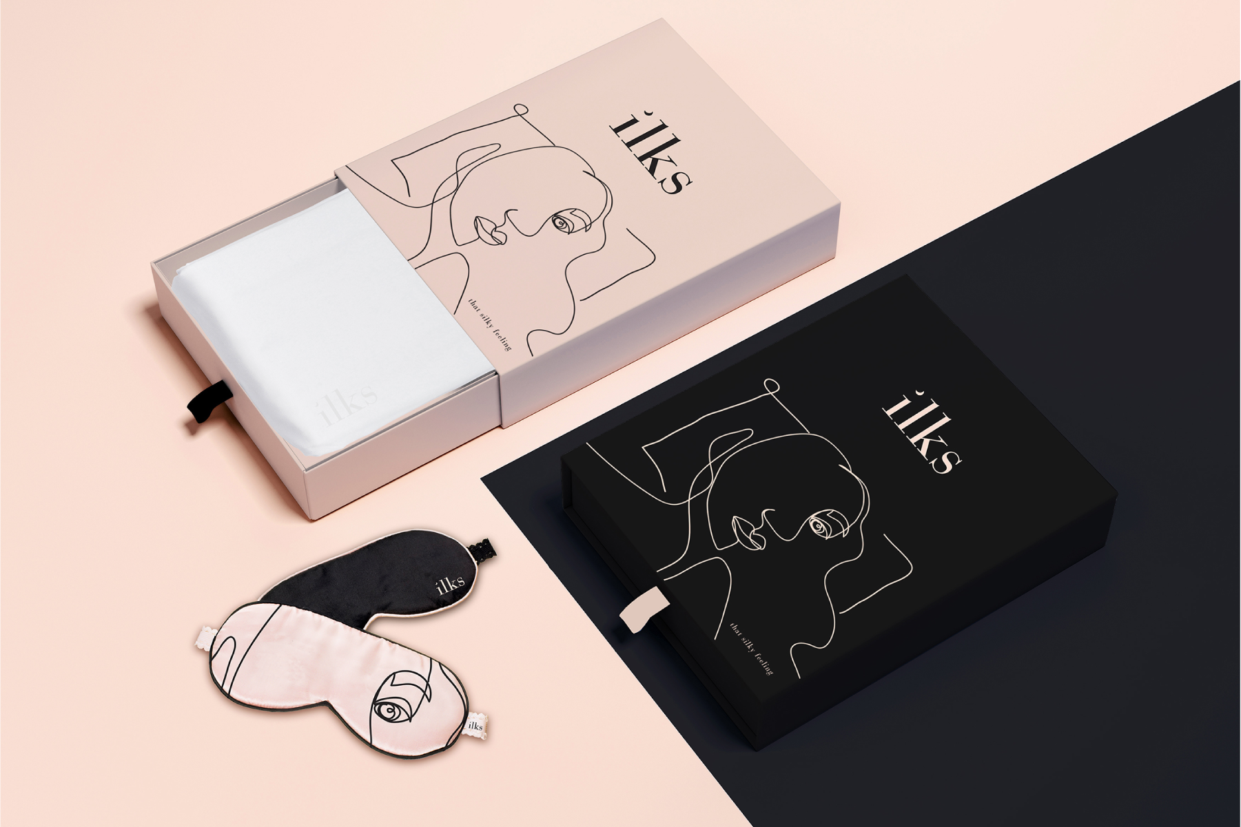
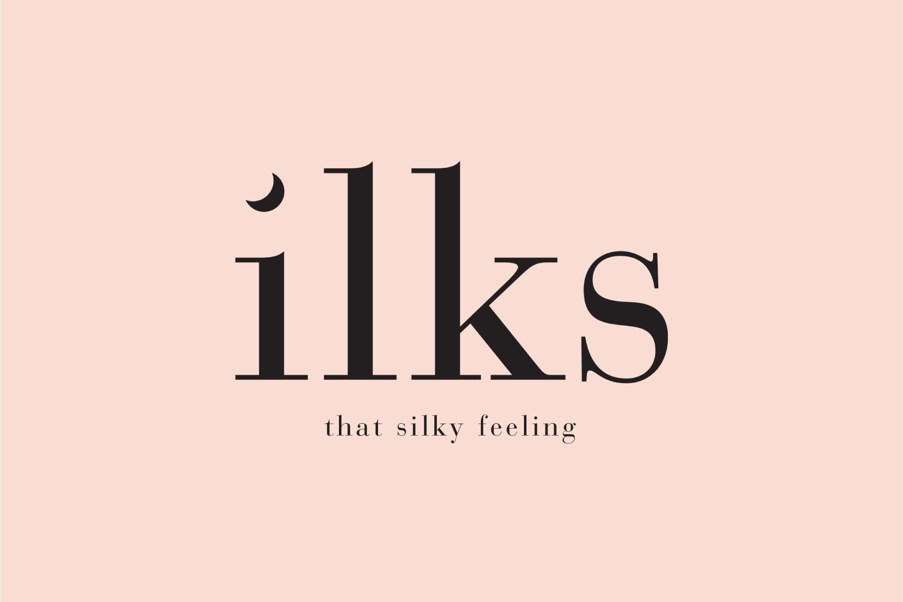
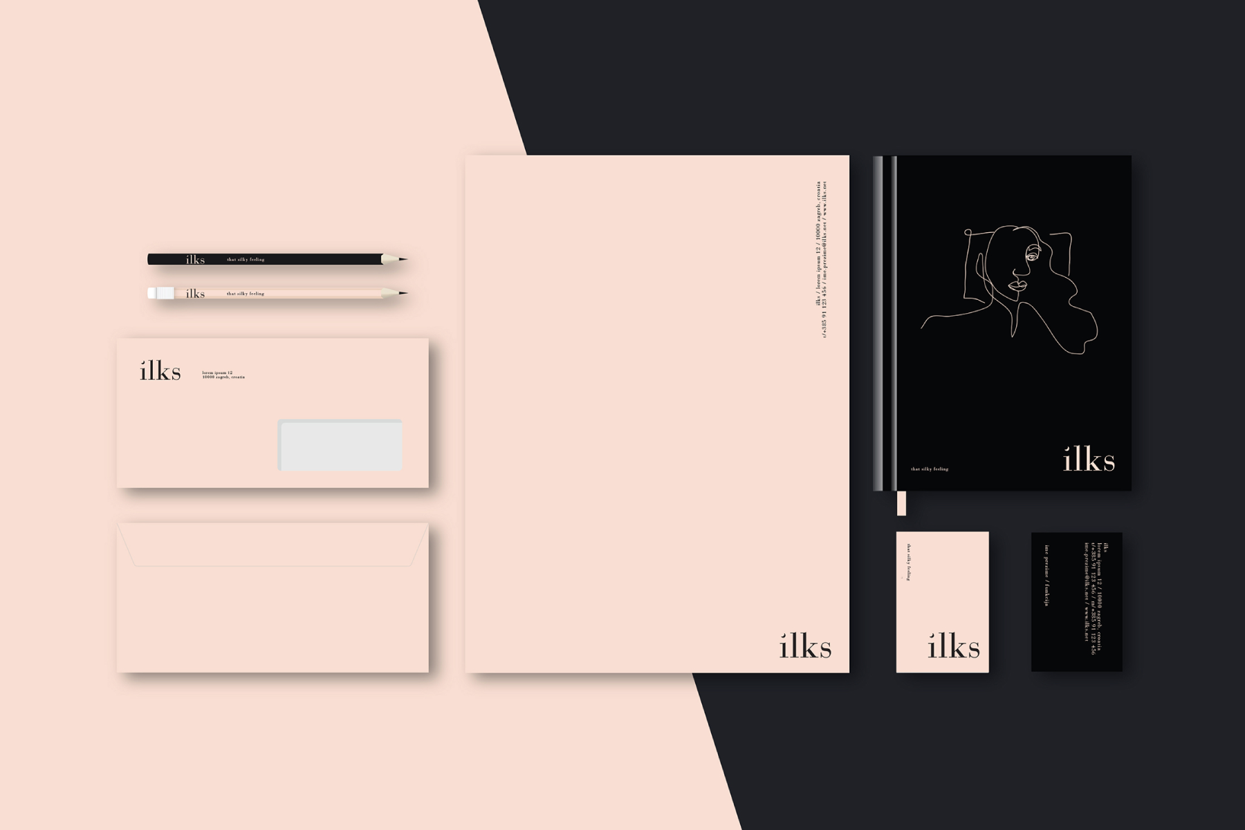
We reversed the letters of the word silk and created the anagram, ilks. The name, along with the slogan That silky feeling, communicates in a playful and dynamic way a supreme sense of sleep in the products’ woven luxury, the most comfortable and finest Mulberry silk.
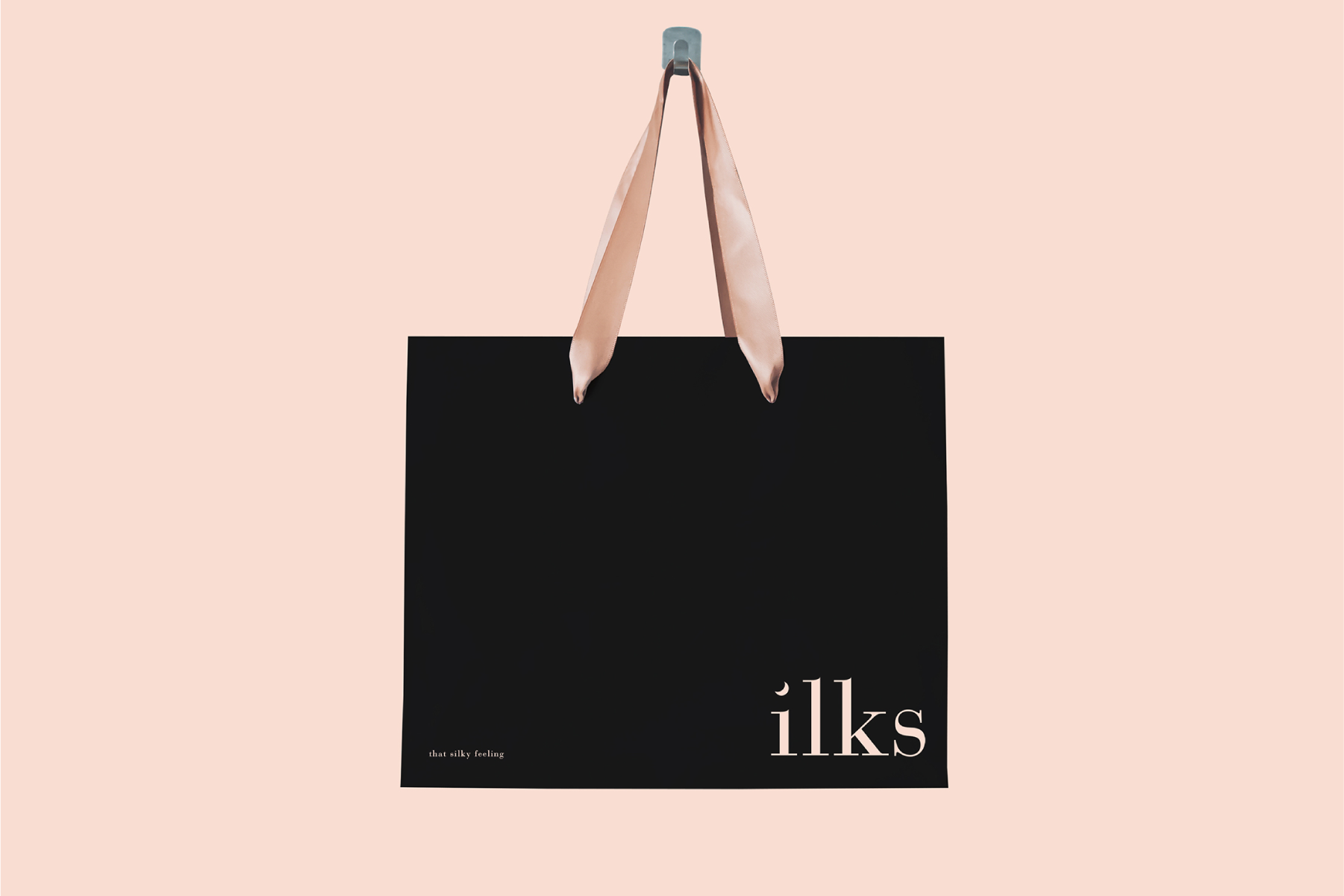
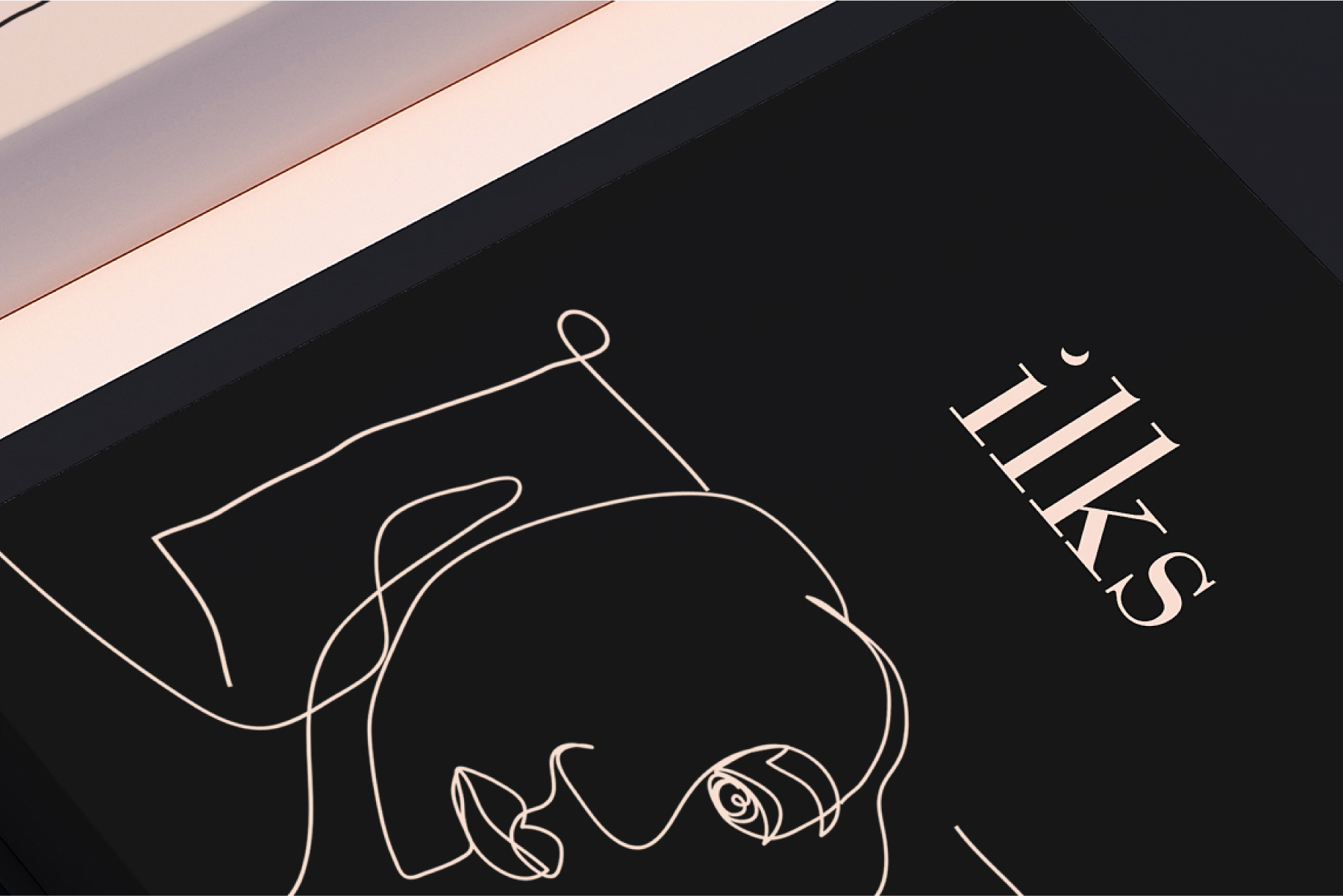
The beautiful visual identity is characterized by an intervention on the initial letter “i” in the word “ilks,” where the dot on the letter becomes a small moon, which clearly emphasizes sleep, quality rest and the good sense of sleeping in silk. Light pink and black were used to emphasize the delicate and strong character of the brand. The brand also uses an illustration characterized by the beauty and purity of a thin line, which, in almost one stroke and in a somewhat cubist style, depicts the face of a woman. With the motif of the illustration we emphasize the benefits of silk for skin and hair, but also evoke That silky feeling.
Brand Strategy & Creative Director: Anja Bauer
Brand Consultant: Stipan Rimac
Name Consultant: Anja Bauer
Copywriter: Anja Bauer
Senior Brand Implementor: Jelena Mezga
Art Director, Designer: Maja Bagić Barić