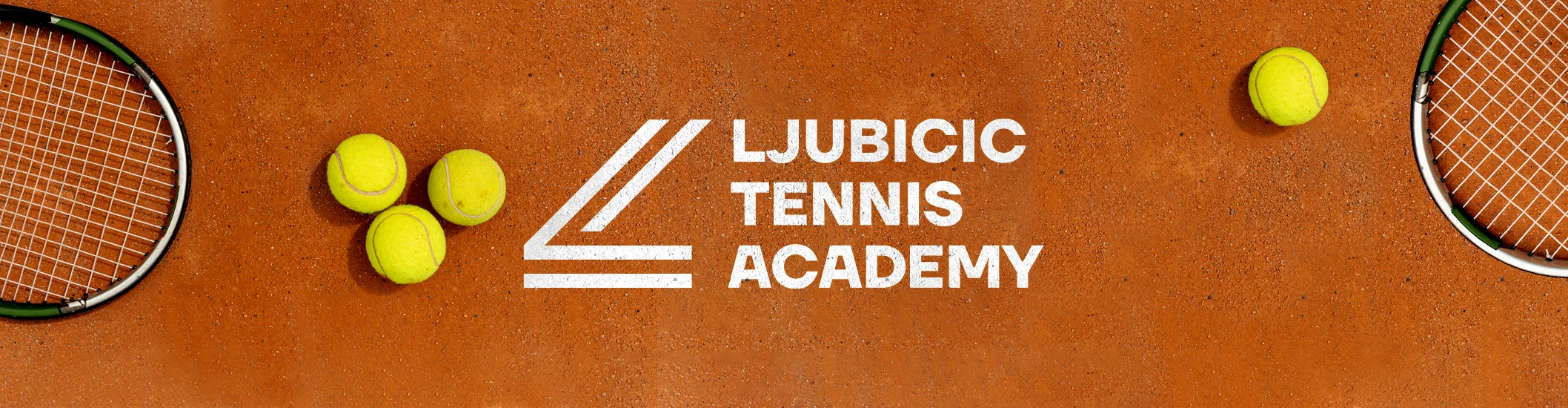
Ljubicic Tennis Academy
We created a brand strategy for the newly opened tennis academy founded by the renowned tennis player and coach Ivan Ljubicic on the island of Lošinj. His vision was to create the best tennis academy in the world and our task was to create a strong and compelling brand story, slogan and memorable visual identity worthy of his mission.
Ljubicic Tennis Academy is a place that brings together professional athletes, young talent and tennis enthusiasts on an island known for its luscious environment and health benefits. Lošinj has superb training conditions with a healthy microclimate, excellent air quality and more than 200 sunny days per year.
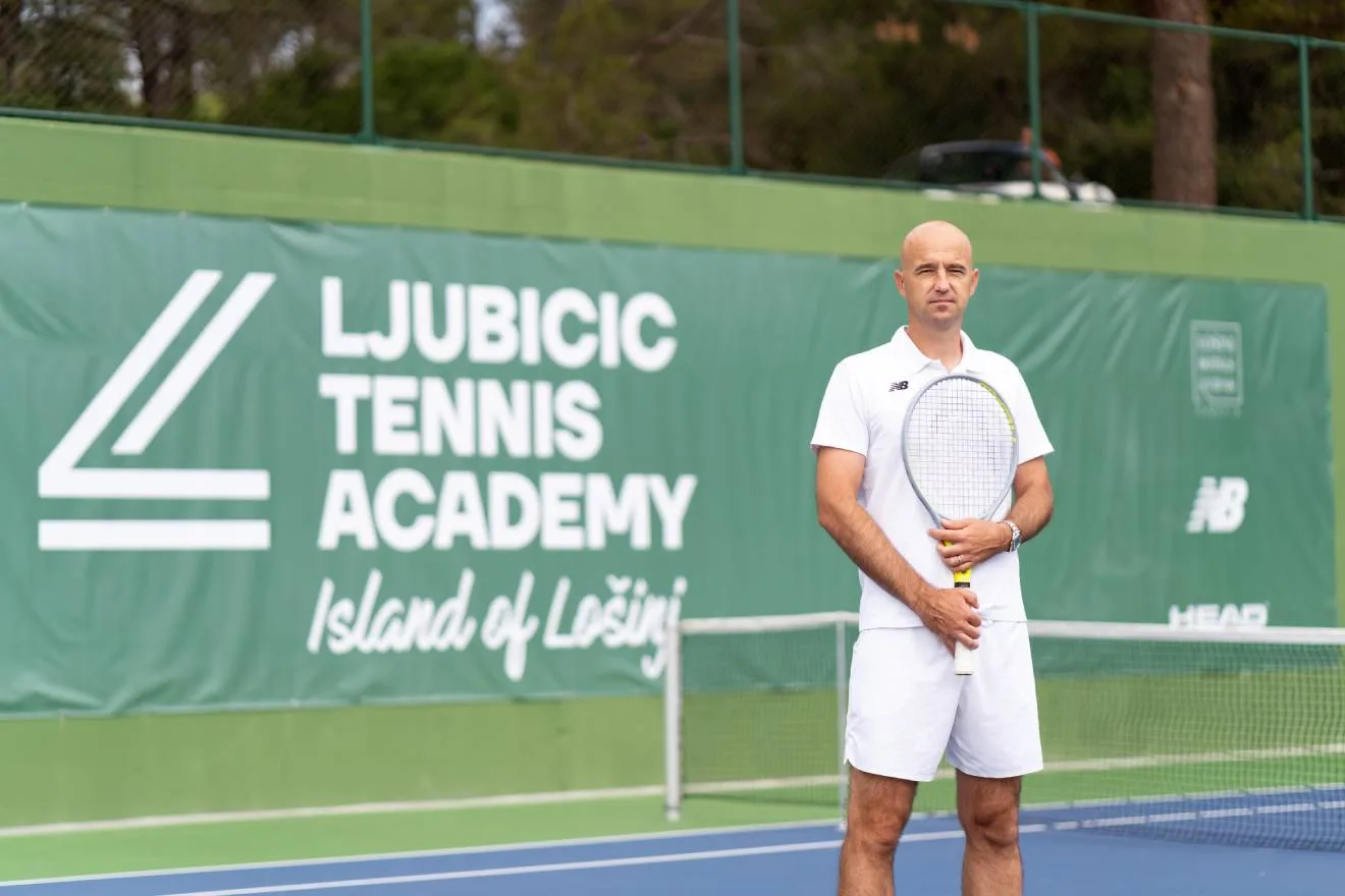
The academy is led by the expertise and insight of Ivan Ljubicic and his top-notch team. Ivan isn’t just the once-third-rank player in the world or the coach of one of the best players of all time, Roger Federer, he’s a great thinker, known and respected for his strategic approach and intelligence. He knows what it takes to be better and stronger against all odds and how to outsmart the person across the net. This was the foundation of our slogan “Be Your Best” and our brand story:
Beat the weakness, be your power.
Beat the adversity, be your progress.
Beat the doubt, be your focus.
Be your best. Learn how to win.
What are you made of?
Are you made of intelligence to outsmart the opponent?
Are you made of the powerful wish to be better today than you were yesterday?
Are you focused and full of intensity to outsmart the person across the net?
Are you made of focus to intensify the strength for scoring that winner?
I challenge you to win against the weaker version of you.
I believe that you can be better today than you were yesterday.
I know what it takes to be better and stronger against all odds. I have walked that path.
I know how to get my player to win against the best. I’ve been there.
The net is the divider but what’s in your head is the real decider of who will win.
Outsmart the opponent, be your best!
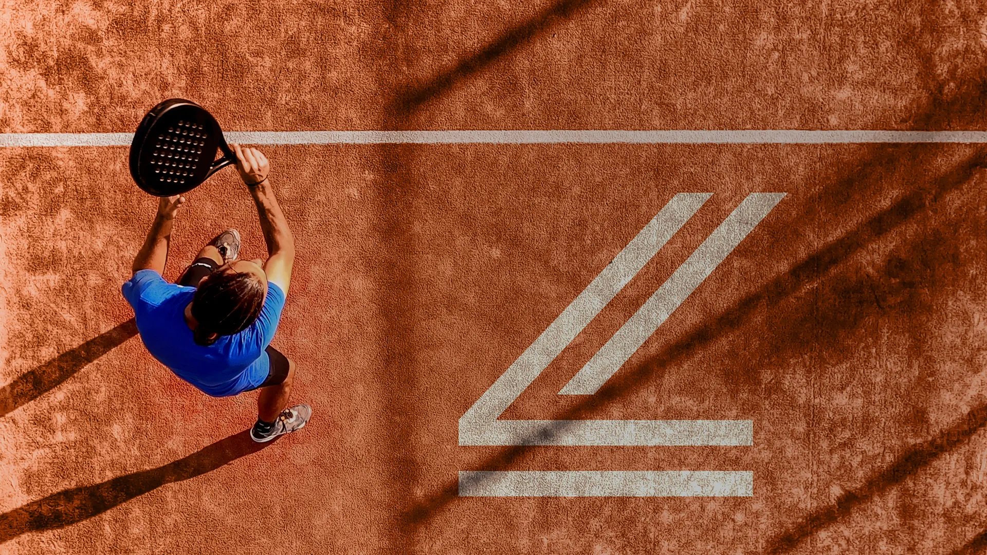
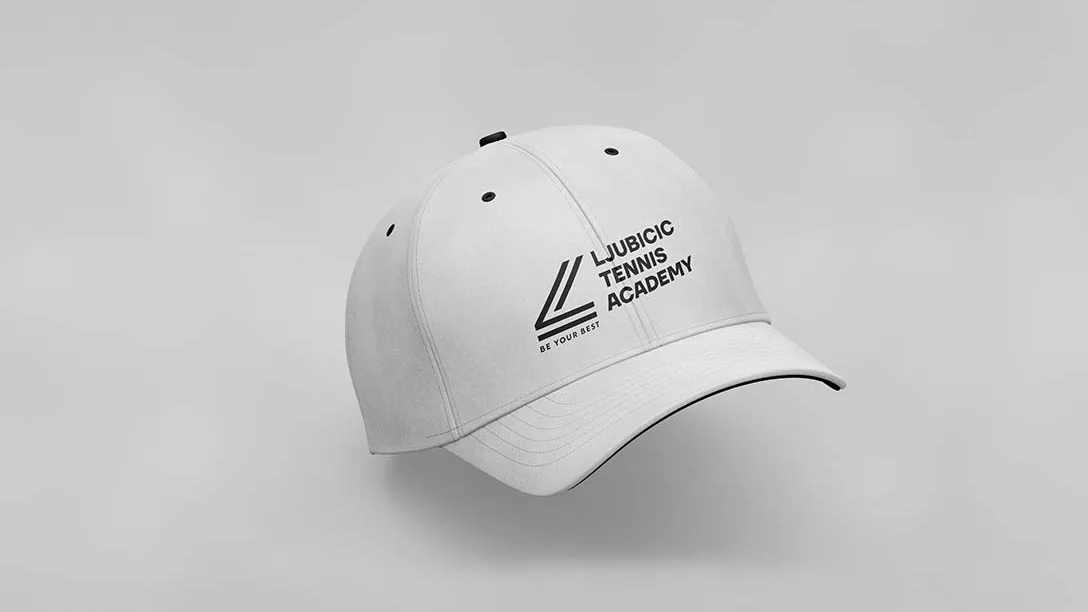
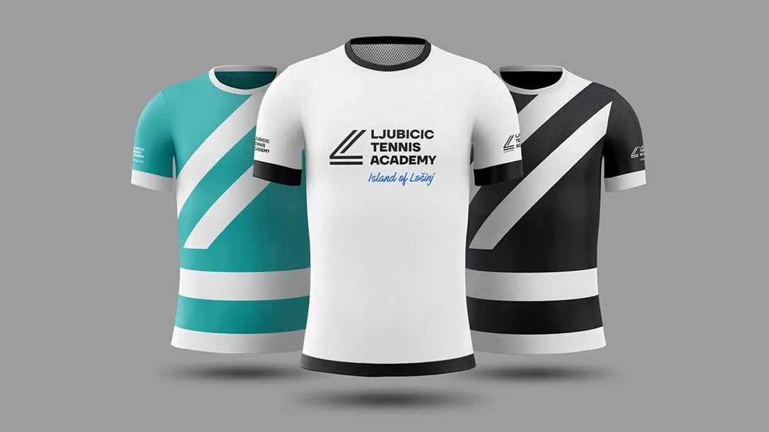
The visual identity is based on the dynamics and aesthetics of tennis — from the visible graphic elements of the game derived from the lines on the court, to the invisible symbols of movement and precise strokes. The symbol is linearly executed and primarily represents the momentum and enthusiasm built from the graphic elements of the game. At the same time it depicts the letter L (Ljubicic and Lošinj). It is strong and intelligent. The colors have been carefully selected to best represent the spirit of modern sports and the environment on the Island of Losinj.

Brand Strategy & Creative Director: Anja Bauer
Senior Brand Consultant: Petra Despot Domljanović
Brand Consultant: Stipan Rimac
Copywriter: Anja Bauer
Brand Implementor: Jelena Mezga
Art Directors: Siniša Sudar, Ena Begčević
Designer: Ena Begčević, Goga Golik, Dragiša Mioč