
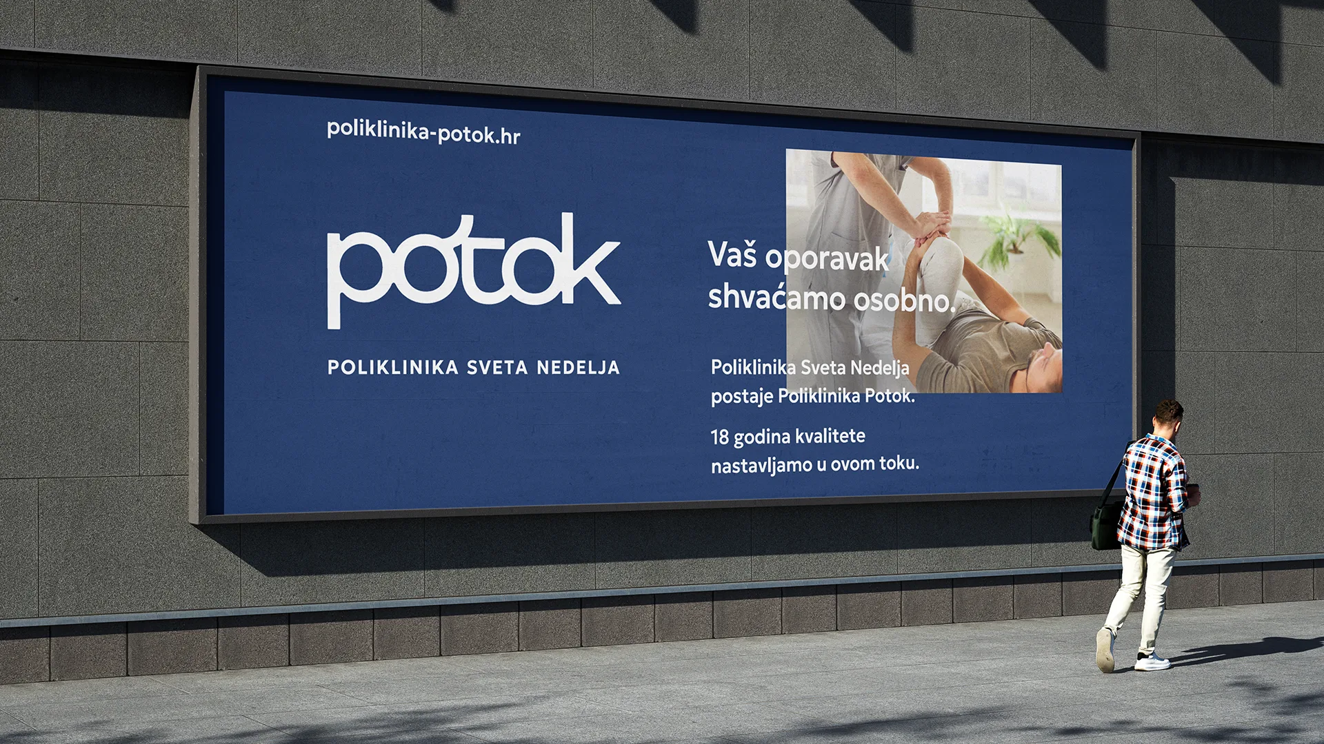
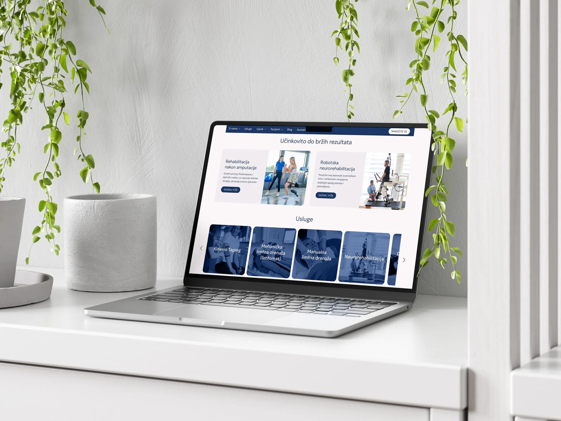
We developed the brand strategy, brand story, name, slogan, and visual identity for Poliklinika Potok. In partnership with Ottobock Adria, Poliklinika Potok represents the largest private center in Croatia and the region for people with amputations and neurological conditions. They provide comprehensive rehabilitation and orthopaedic aids of the highest medical standards, all under one roof. At the heart of the new brand story is an exceptional team of medical professionals who deliver faster results through their personal, warm, and professional approach.
“We take your recovery personally. Throughout your therapy, you will be under the attentive supervision of a doctor and a dedicated team of physiotherapists.Thanks to this personal and professional approach, therapy can be shortened by as much as one full cycle. Range of motion improves, mobility returns faster, and you can come back sooner to the everyday life you long for.
This extraordinary team is fully committed, under the constant presence of a doctor during therapies. Because of this dedication, recovery time is reduced, and even one day gained feels like a gift. Gift yourself an hour, a day, even a whole recovery cycle sooner. Entrust your recovery to the exceptional team of this polyclinic. Let Polyclinic Potok truly be the place where even one Sunday sooner becomes a reason for your trust and joy. Extraordinary team creates faster results. Extraordinary team, faster recovery.”
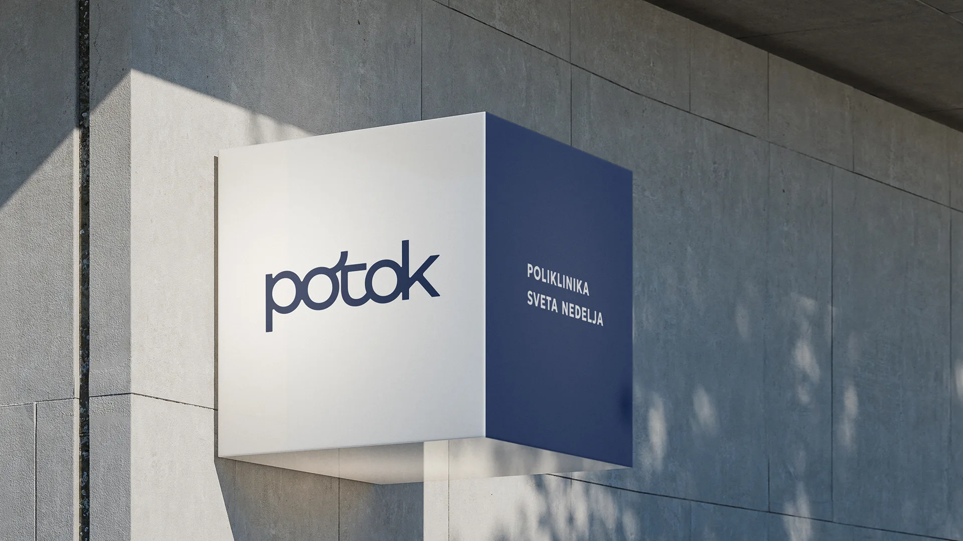
The name was inspired by the many crystal-clear streams and tributaries that characterize the Žumberak and Samobor Hills region. The new name, Potok (meaning “stream”), evokes a source of strength and health, as well as continuous progress. The slogan, “We Take Your Recovery Personally”, communicates the personal, warm, and professional approach of the clinic’s exceptional team.
We also developed a series of key messages highlighting the exceptional team of doctors and physiotherapists, their personalized approach, and their ability to achieve faster results, including: “An Extraordinary Team Delivers Faster Results”, “Extraordinary Team, Faster Results”, “Feel Better by this Sunday”, “Expect a Faster Recovery”, “Expect Warmth and a Personal Touch”, “A Personal Approach Makes All the Difference”, “Achieving Faster Results Through Effective Care”, “Enhanced Range of Motion and Mobility”, “Entrust Your Recovery to an Exceptional Team”, “Get Back to Your Everyday Life Sooner”, “Dedication That Shortens Recovery Time”, “Reducing Therapy by One Cycle”, “People Should Be Guided by the Right Ideas”, “Inspired by the Right Values”, “Emotions Drive Everything, from Progress to Recovery” and “Your Recovery Is in Our Hands”.
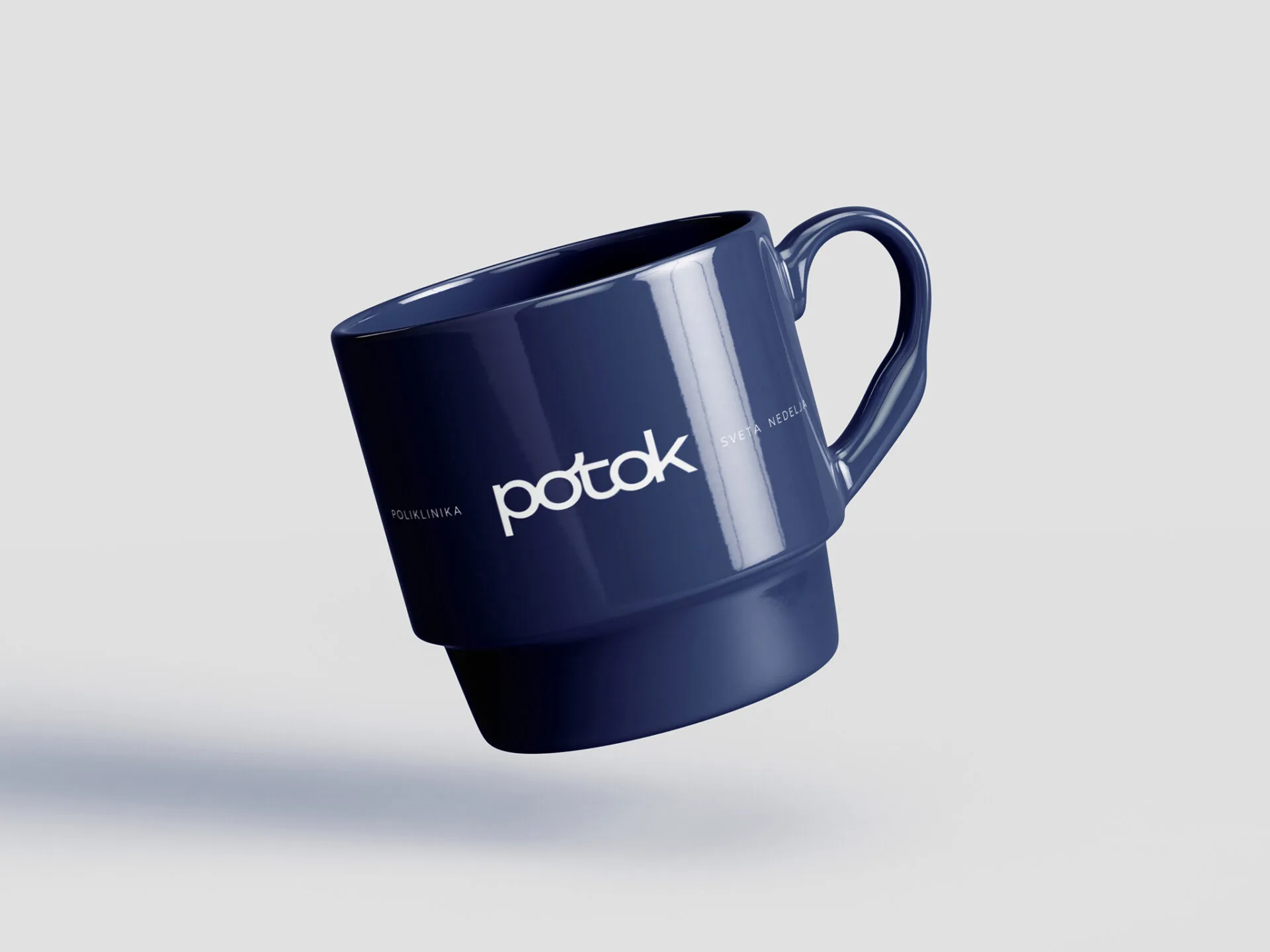
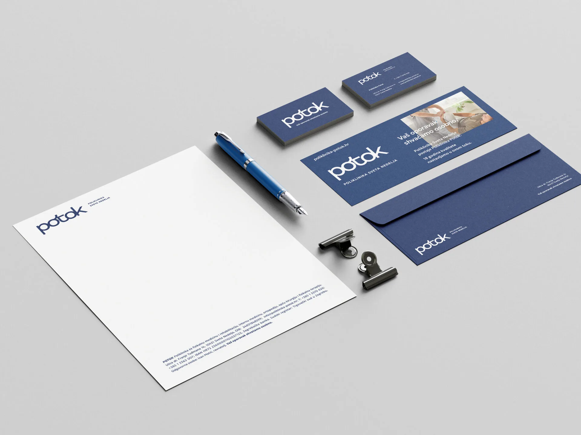
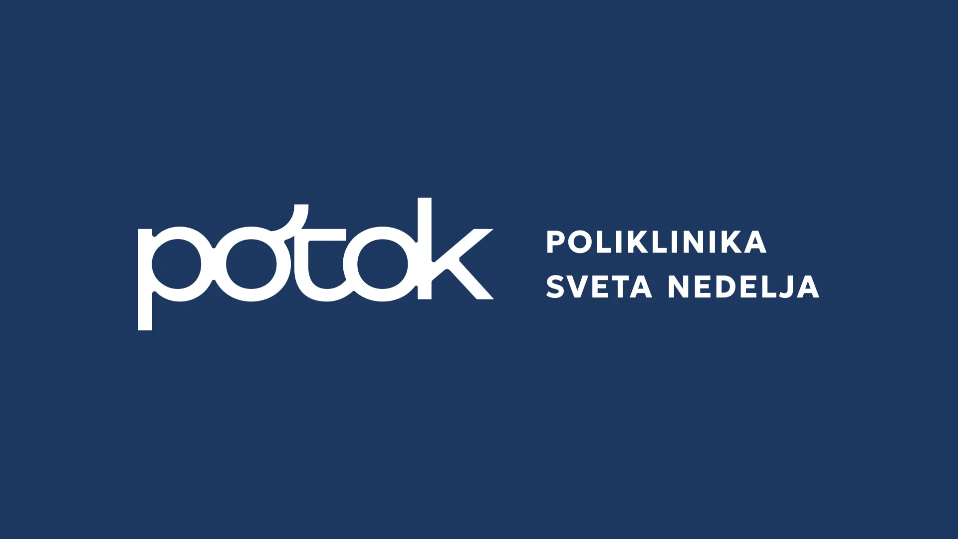
The visual identity is built around flowing typography, with soft transitions and connected letters that seamlessly blend into one another, evoking the natural flow of water. The interconnected letterforms symbolize the continuity of rehabilitation, the restoration of mobility, and the journey toward recovery. Smooth transitions and organic connections resemble the meandering curves of a stream, giving the logo a modern appearance.
The deep blue color metaphorically conveys medical expertise and the recovery process while inspiring a sense of trust. The concept combines the natural dynamics of movement with the stability and support the clinic provides to its patients.
Brand Strategy & Creative Director: Anja Bauer
Naming Consultant: Anja Bauer
Head of Brand Strategy: Petra Despot Domljanović
Senior Brand Implementor: Jelena Mezga
Senior Brand Consultant: Maja Đaković
Brand Touchpoints Creator: Petra Crnički
Brand Trends Analyst: Ella Katherine Orešković
Copywriter: Anja Bauer
Art Director / Designer: Igor Manasteriotti
Designer: Mia Marić
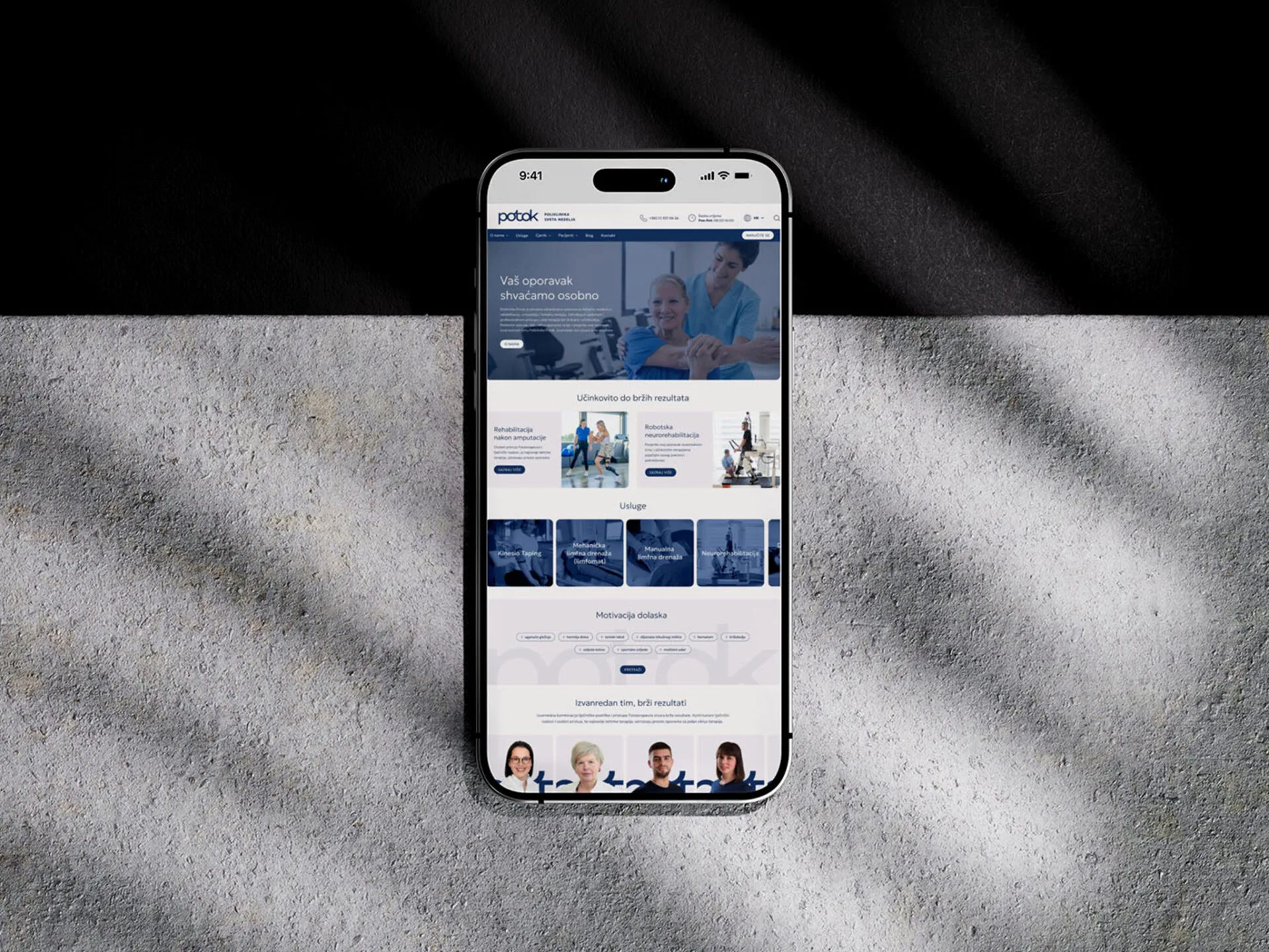
Web design: Roberta Cindrić
Motion Graphics: Rudi Bauer