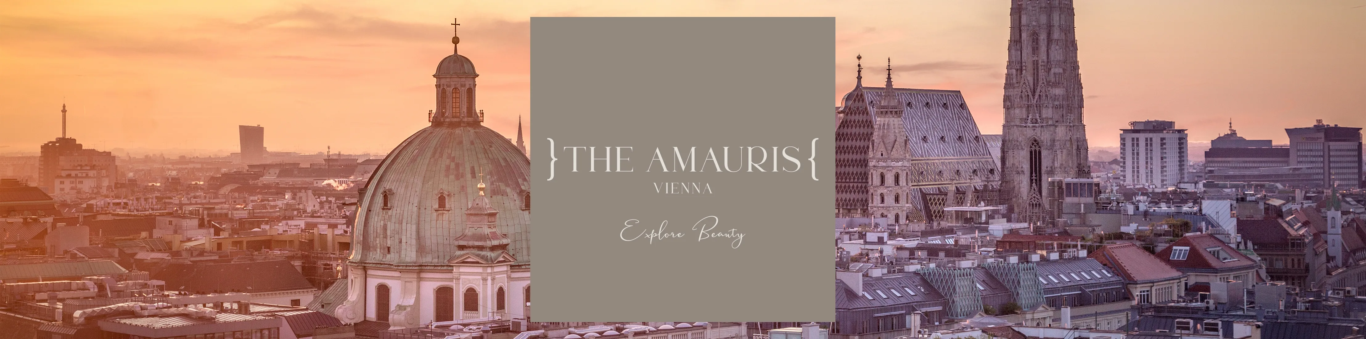
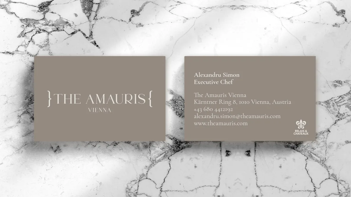
The Amauris
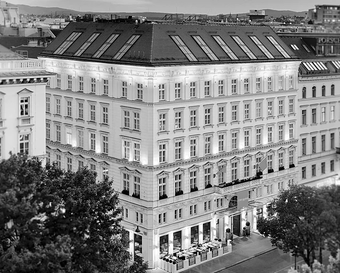
We created the brand strategy, new name and visual identity of the luxury boutique hotel The Amauris in Vienna, located on the famous Ringstrasse, between the Vienna State Opera and the Musikverein concert hall. Our task was to create a unique memorable story that will differentiate the hotel from renowned hotel brands located nearby.
Our story united the wishes of discerning travelers with the imperial heritage and the grandeur of the 19th century Vienna. During that period many monumental buildings were built in Ringstrasse, including the building of our current hotel. Viennese city palaces were the meeting places for international travelers, artists and crème de la crème of the society. Today, we treat our guests like modern-day royalty and anticipate their wishes. Our guests travel widely across the world yet would like to blend in with the local culture. All those elements brought us to a surprising answer: The Great Monarch Butterfly. The metaphor communicates greatly the meaning of our hotel and our guest:
“Our guests’ wishes are anticipated. Rest will come easy in these surroundings.
They are inquisitive about places they visit, want the local feeling yet come back to the hotel for the international grade of pampering.
Metaphorically speaking our guests are like the Great Monarch butterfly. One would say that butterflies are just pretty, but they are more than meets the eye. They travel miles and miles, they pollinate flowers, they are a messenger of change in the environment and incredibly inspiring in their beauty. They are a thing of intricate meaning and beauty.
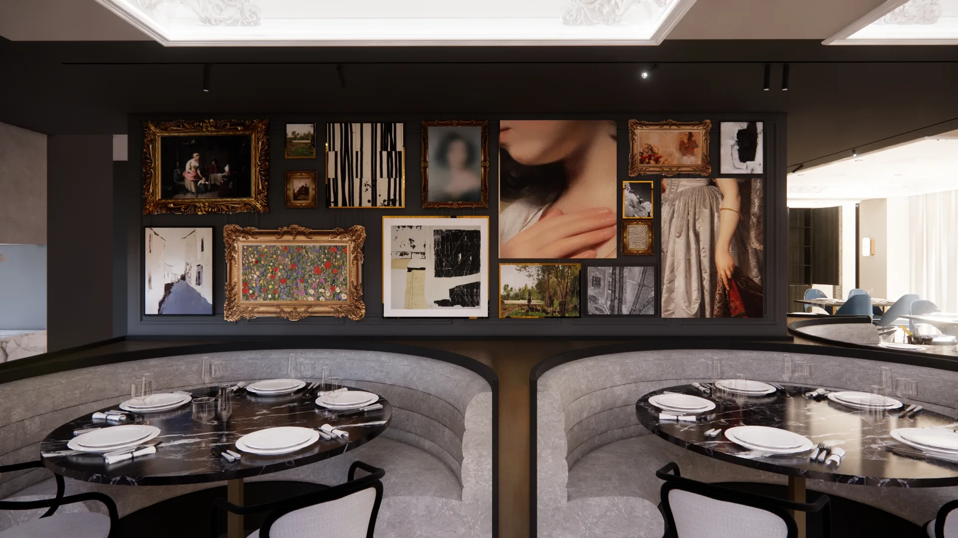
It is our task to make what guests see, touch, feel or taste inside the hotel a beautiful mesmerizing experience. Our homemade pastries, beautiful art, plush bedding will make them feel satiated and inspired and will satisfy the curious minds and palates. Our wines, coffee and small bites are sumptuous bits of adventure worth narrating.
When we narrate our experience we relive it and that is one thing our guests want to do – relive their experience with us.”
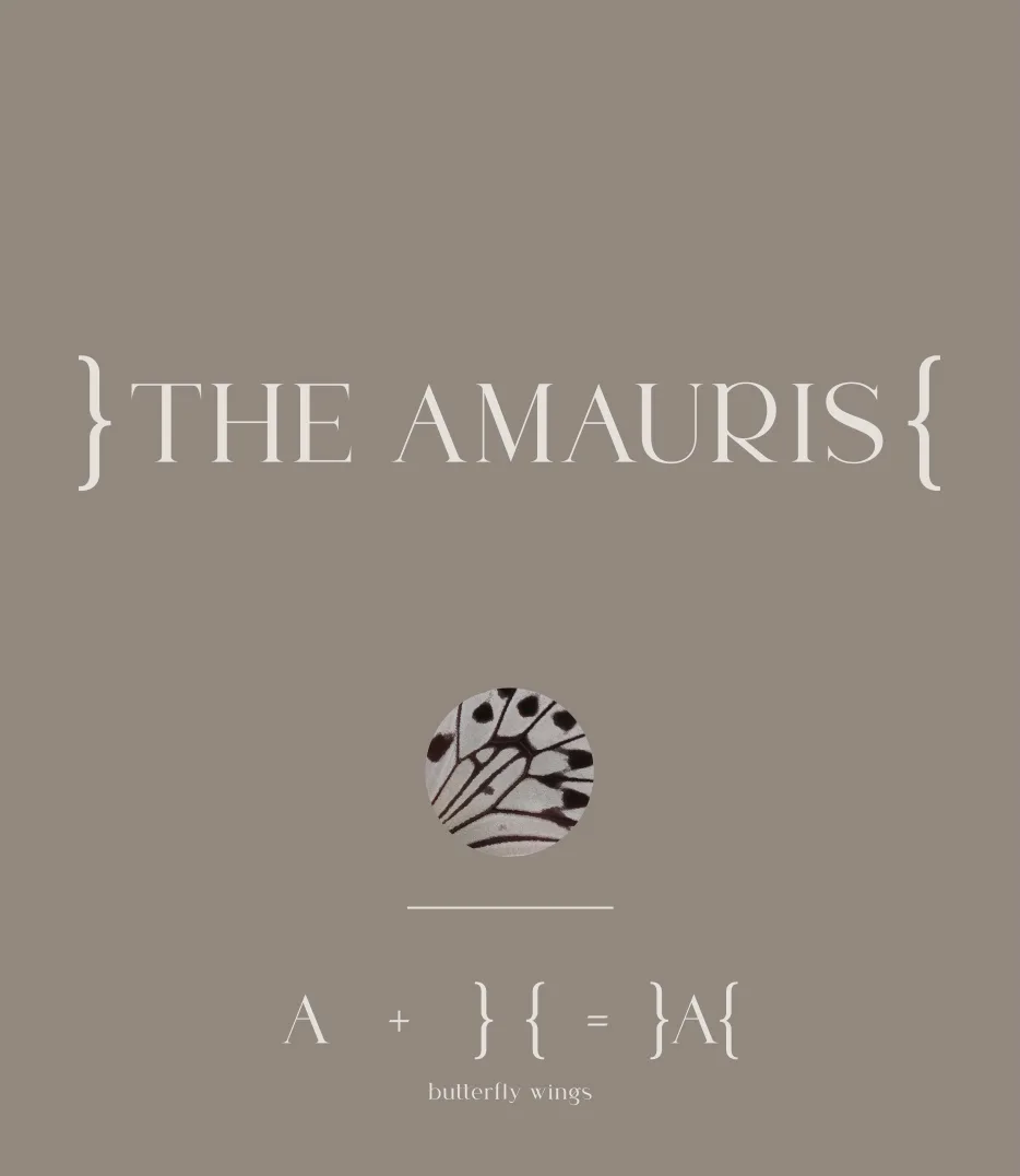
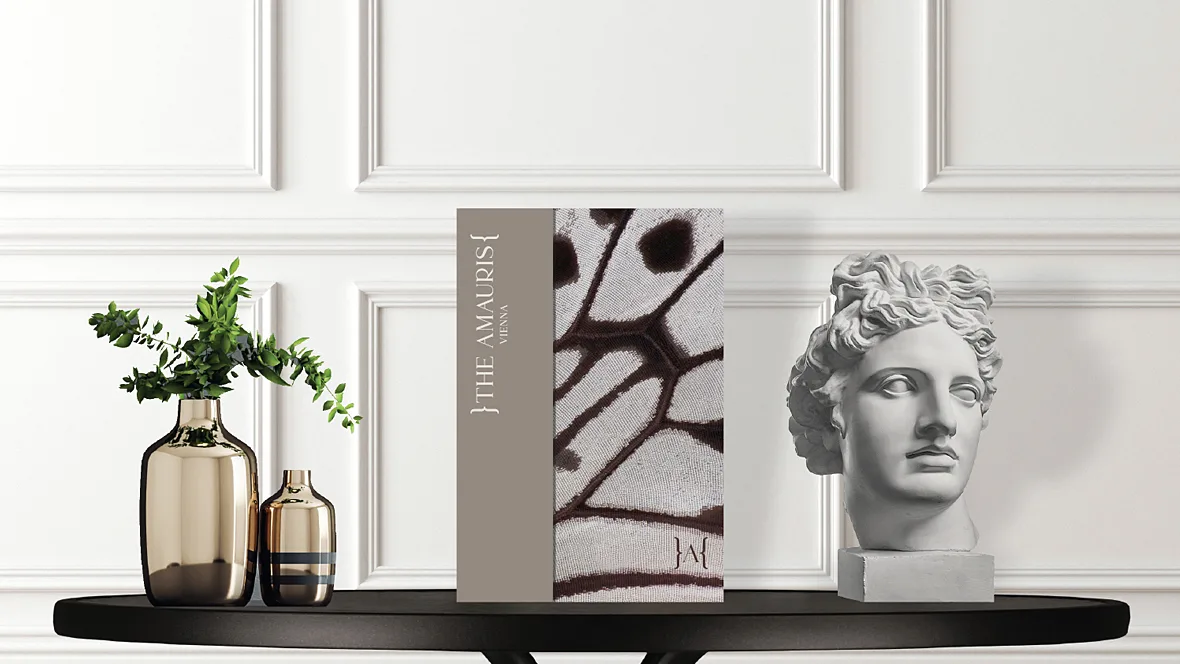
We named the hotel “The Amauris”, after a type of butterfly that belongs to the nymphalidae family to which “The Great Monarch” belongs. The slogan “Explore Beauty” invites guests to explore beauty in every corner of the hotel – in luxurious hand-made fabrics, rich flavors, carefully curated artwork and surprising details, as well as in the destination they’re visiting.
In addition to the name of the brand, we named the hotel restaurant Glasswing, after a butterfly known for its exquisite beauty and delicate, see-through wings. This perfectly reflects our culinary philosophy – serving exquisite dishes made from the finest micro-seasonal ingredients.
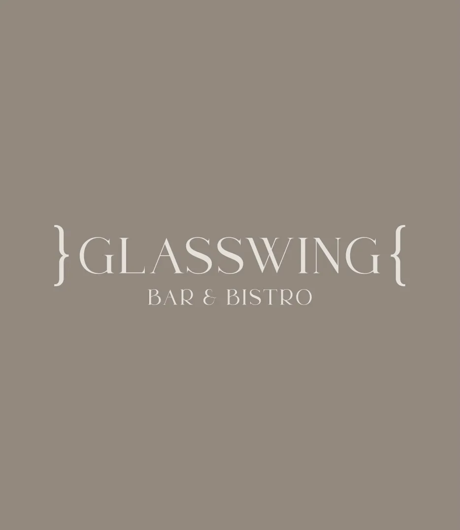
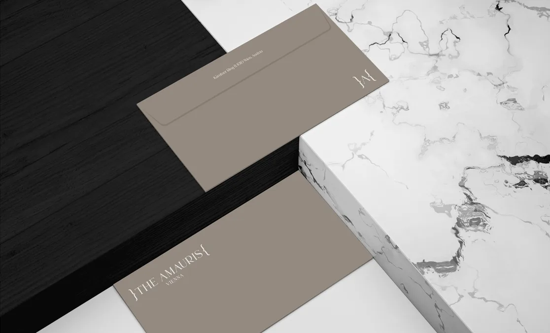
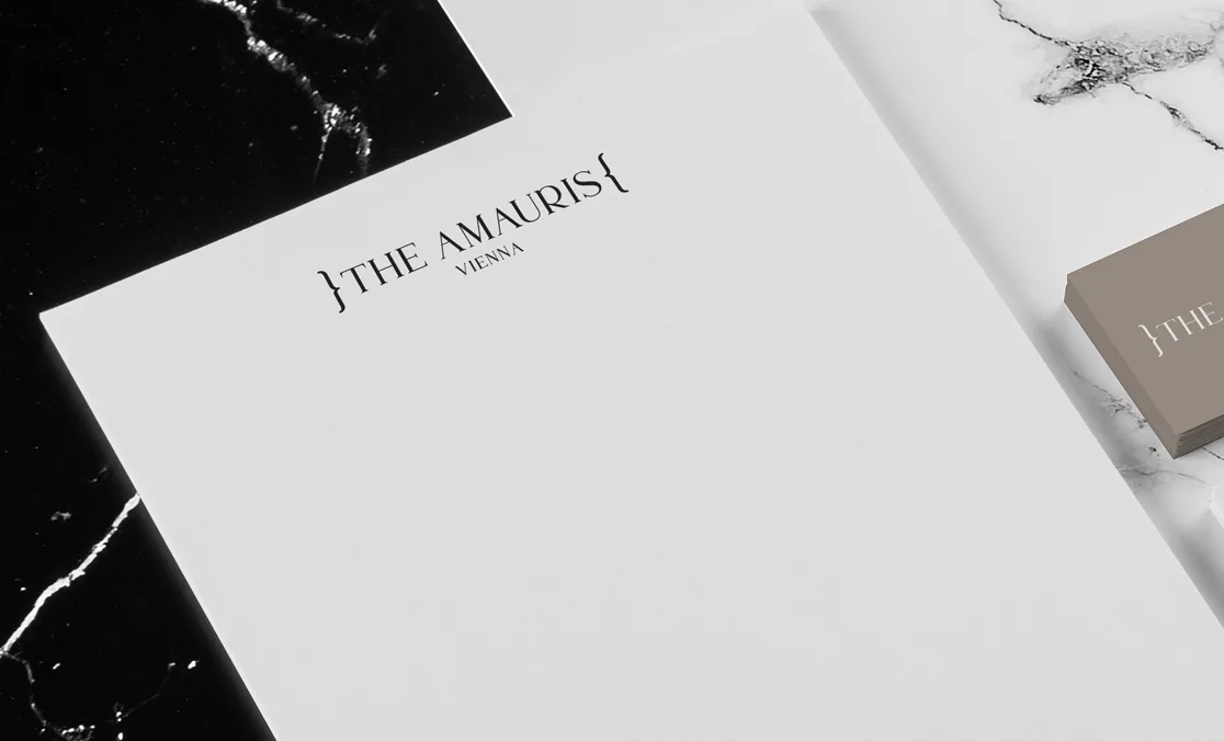
The elegant and refined visual identity is the work of art director Maja Bagić Barić. The sign is a typographic solution formed from the letter “A” set between two brackets that mimic the wings of a butterfly. The typography is serif, elegant and modern and gives the logo a refined and contemporary look.
Brand Strategy & Creative Director: Anja Bauer
Senior Brand Consultant: Petra Despot Domljanović
Naming Consultant: Anja Bauer
Copywriter: Anja Bauer
Senior Brand Implementor: Jelena Mezga
Art Director/Designer: Maja Bagić Barić