Split United is a project that links and revitalizes two key locations in Split, the city’s eastern shore and the area of Kopilica. We have been working on a brand strategy, a brand story, name, slogan, and visual identity for Split United, as well as verbal and visual communication.
The vision of the Split United project is to modernize and connect the currently separated, unused and underdeveloped parts of the city with new roads and infrastructure in accordance with expert analysis and research, but also to lay a foundation for further transport and architectural innovations. With the Split United project, Split aims to become a Mediterranean city of the future that will function with a multifaceted urban center.
Our key challenge was to present the project in the context of today, while referring to the possibility of the city’s future development. It was important to create a powerful story that would refer to Split’s heritage, but also to convey a positive and unifying message for the future and further development of the city. The vision of the future, the backbone of our new story, is based on long-term urban planning aimed a uniting the image of the city, connecting the past and the future, the old and young, locals and the imaginative, turning Split into a Mediterranean city of the future.
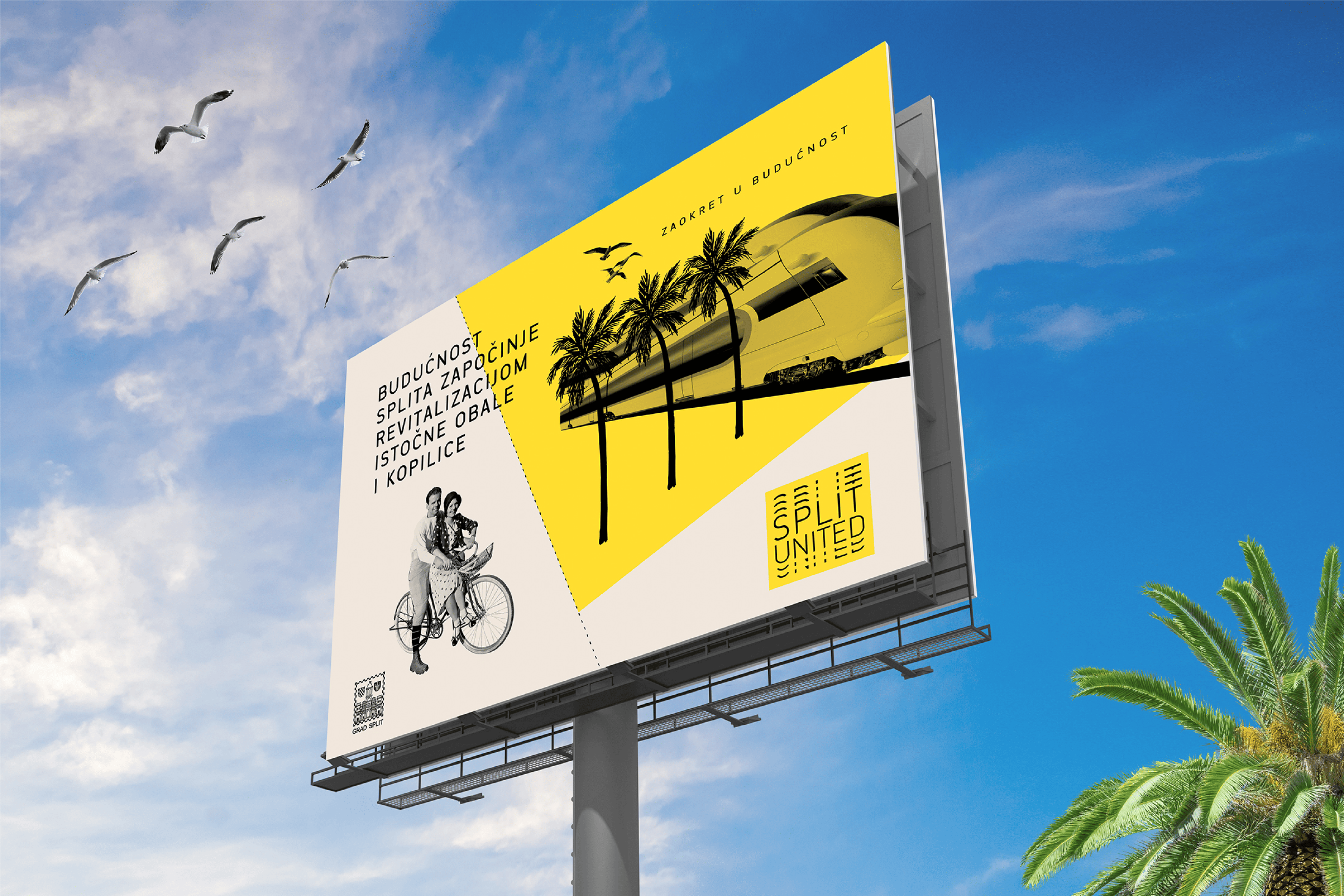
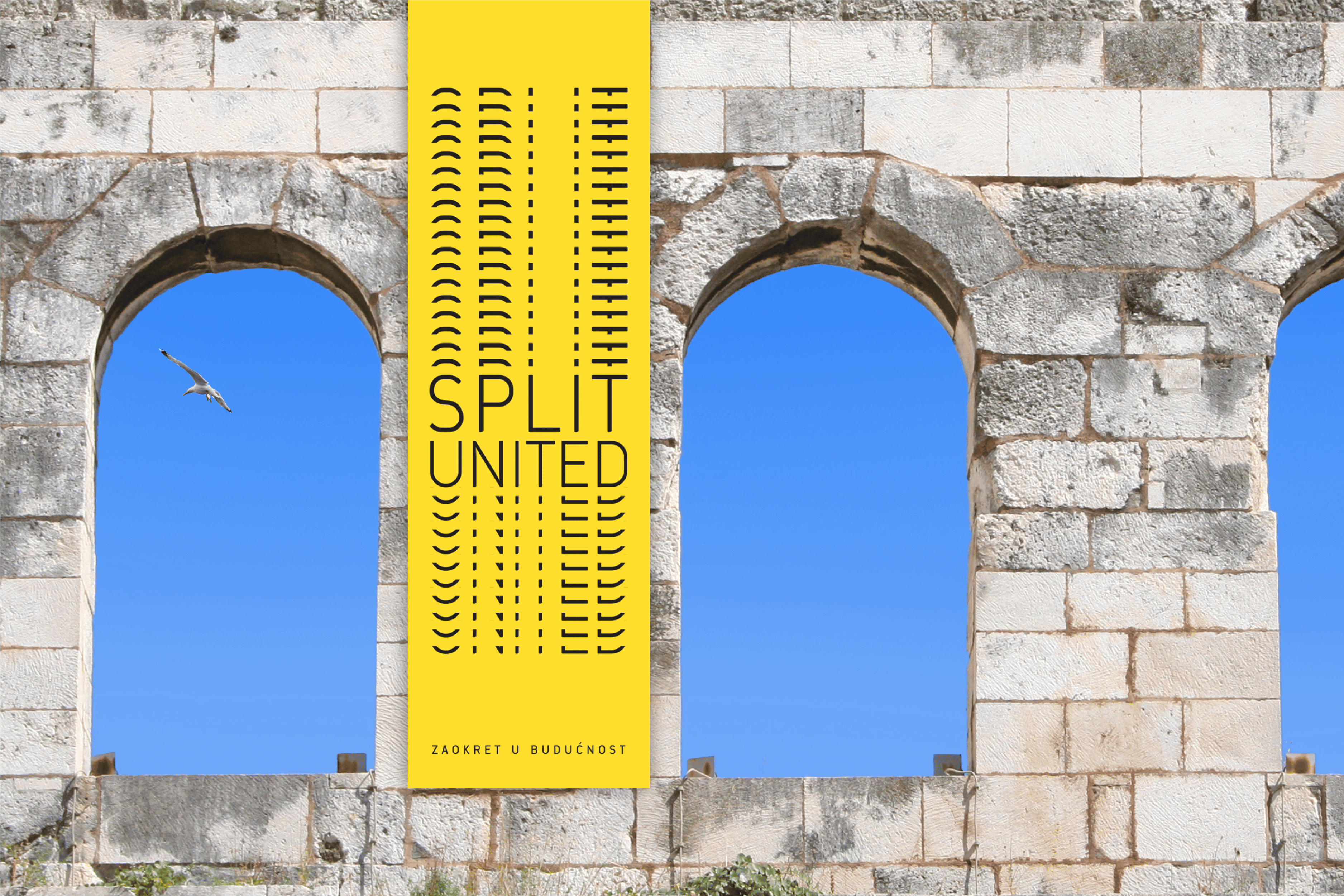
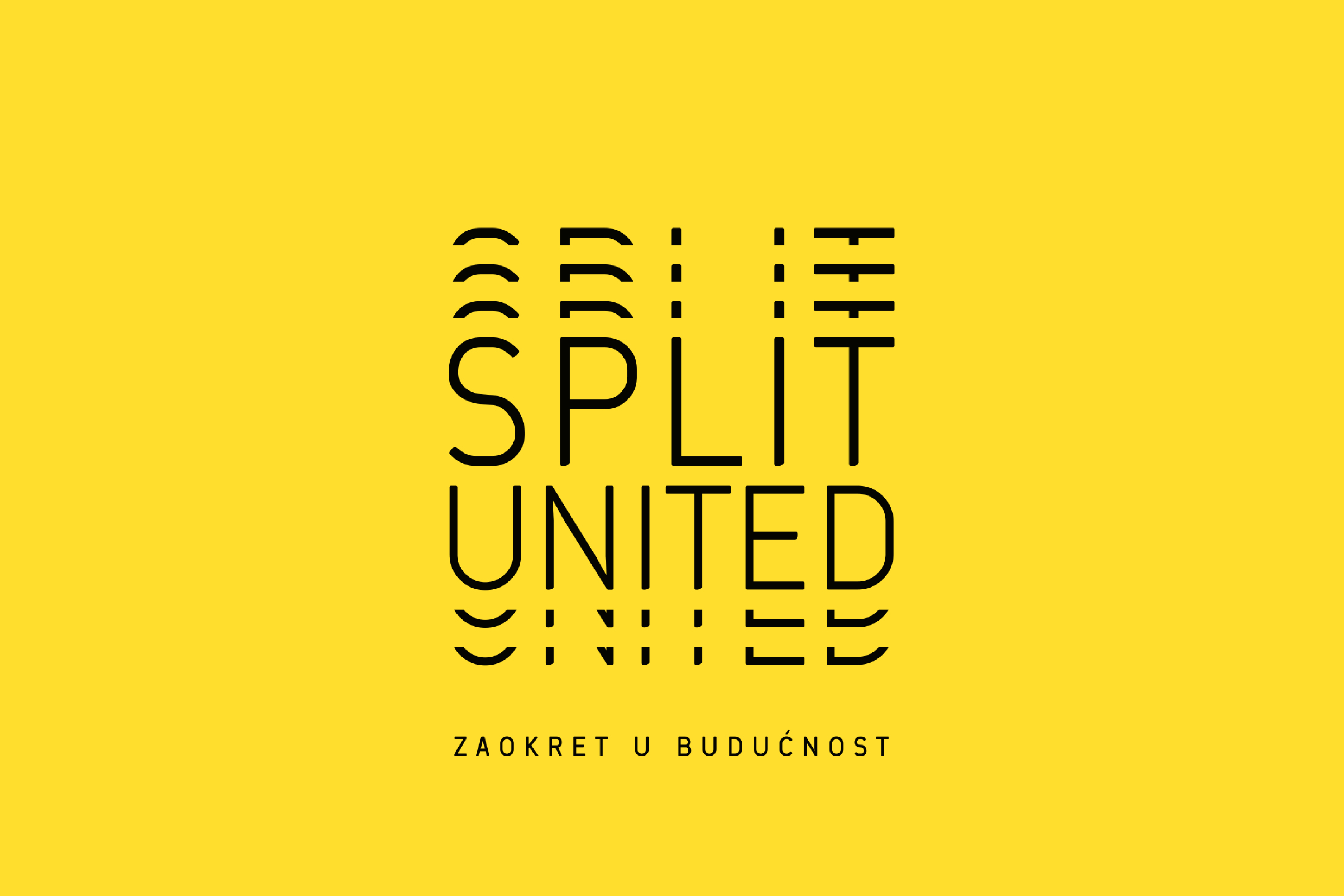
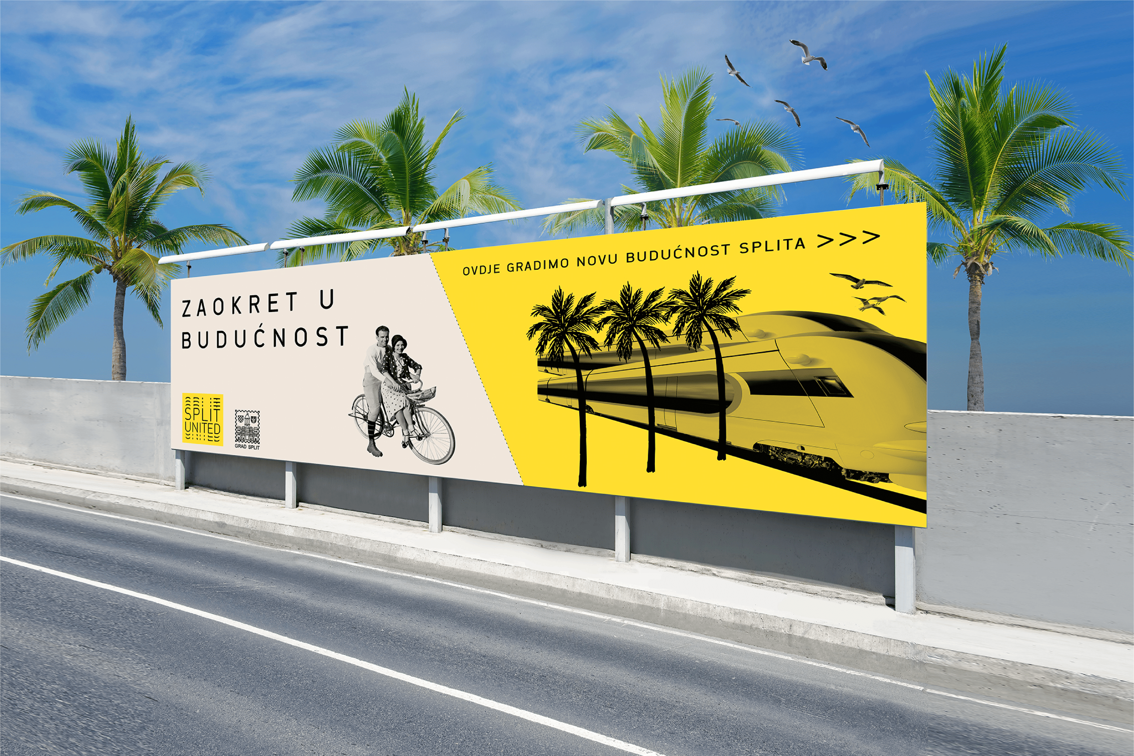
The name Split United refers to both the name of the city and the problem the city was facing, as it is “split” in terms of traffic and development. “United” indicates the result of the project’s completion, which will unite the city with the construction of the Intermodal Railway Center.
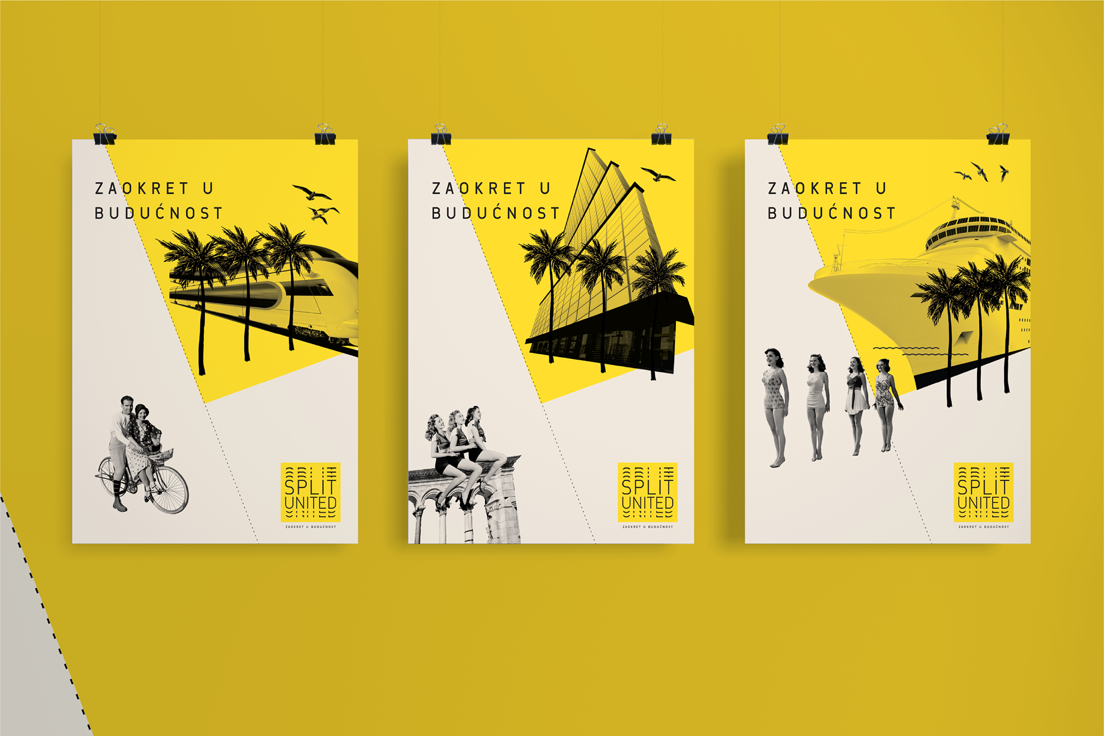
The slogan “Turning to the Future” indicates the city’s turn towards its most valuable resource, aside from its residents, space. By turning towards the future in a position that unites, the foundations for Split’s advancement will be laid.
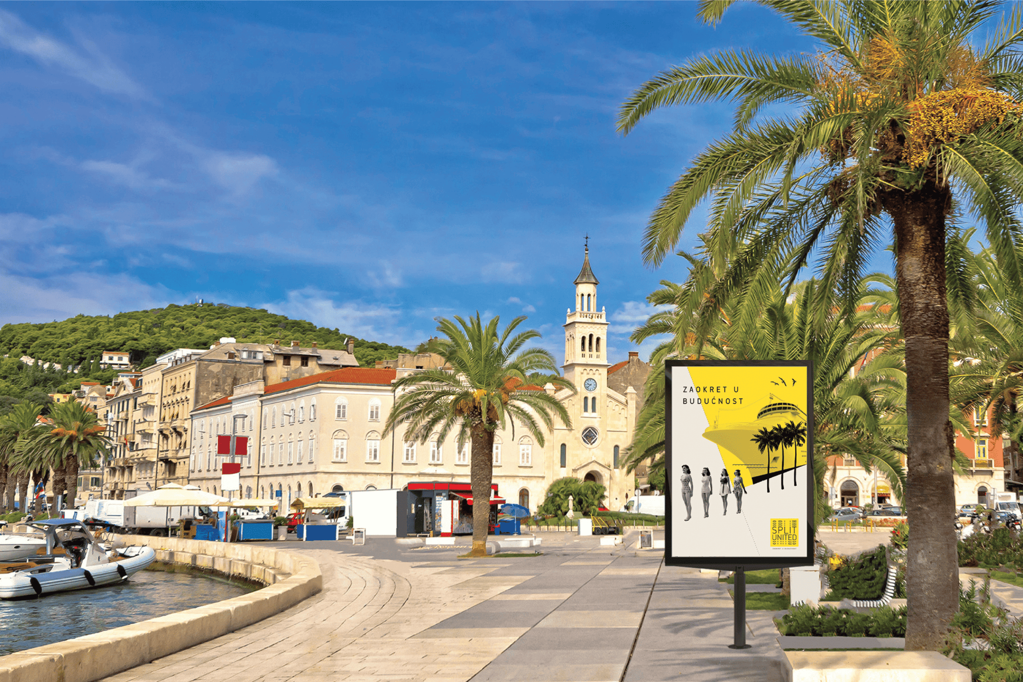
The new visual identity conveys the connection between Split’s past and future. In the print materials, the emphasis is placed on Split as a city of the past where structures and historical layers from ancient Rome, through the Middle Ages are all still visible, while also capturing Split as a modern and vibrant city of the future. The dynamic image of time’s flow is represented by a segment of repeated letters at regular intervals. The use of yellow symbolizes the energy of the sun that Split, as a Mediterranean city, has in abundance. The project idea was presented to the general public in a showroom, where all design materials were developed by designers Mišo Komenda and Karlo Kazinoti.
Brand Strategy & Creative Director: Anja Bauer
Senior Brand Consultant: Petra Despot Domljanović
Junior Brand Consultant: Lena Došen
Name Consultant: Anja Bauer
Copywriter: Anja Bauer, Lena Došen
Brand Implementor: Jelena Mezga
Art Director: Maja Bagić Barić
Designers: Maja Bagić Barić, Mišo Komenda, Karlo Kazinoti