We created the brand strategy, name and visual identity of the new mobile payment app. It is an advanced platform that enables simpler contactless payments at vending machines around the world, but also at a number of other “self-service” points of sale such as parking lots, laundries or photo booths.
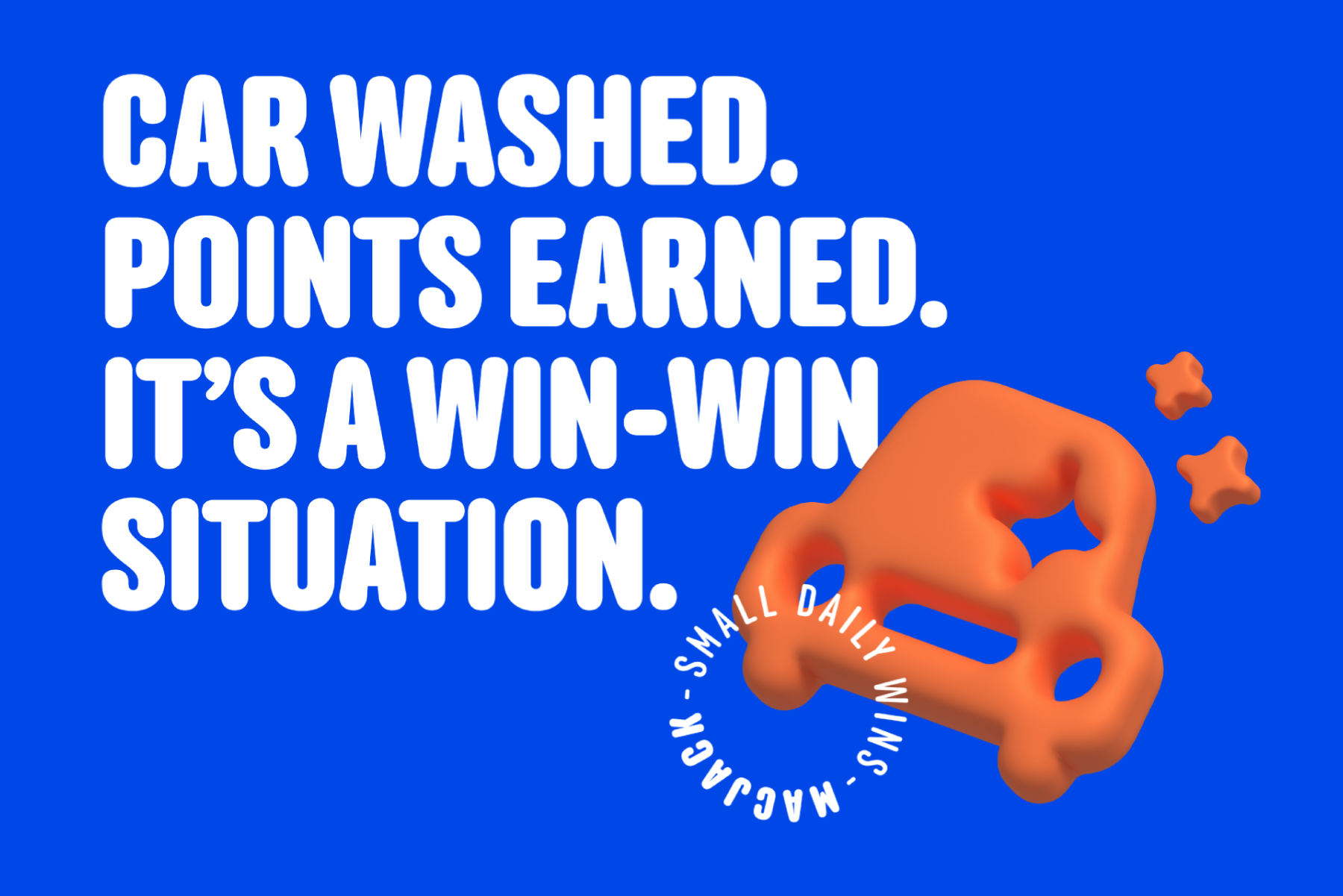
We turned the two key benefits of the application – ease of payment and rewards when purchasing – into a fun brand story that everyone can identify with. Our new story celebrates the small, everyday wins that make up life, like taking a coffee break after a busy meeting or doing laundry on a Wednesday night.
“Small wins are not huge wins, they are wins that make us content and appreciative of the smaller things in life. They make life better.
Monday mornings are not as exciting as Friday evenings. But what of all the days in between?! All that time before and after Friday evening is filled with errands that need to be done.
Whether it’s going to the gym and afterwards coming to the vending machine for a quick pick me up, taking a quick photo at the photo booth for the upcoming overseas trip, washing your car on a cold Thursday evening, or doing your laundry on a sleepy Wednesday afternoon.
Accomplishing these daily tasks is a small win. Literally, they are things that make up an average day. Our brand makes people’s lives better, simpler, and easier by rewarding them points each time they pay through our app after performing one of these everyday tasks.
Well, that’s what life is made of. These small everyday wins. A small win is not a huge win, but that’s what life’s about, the rest is Hollywood.”
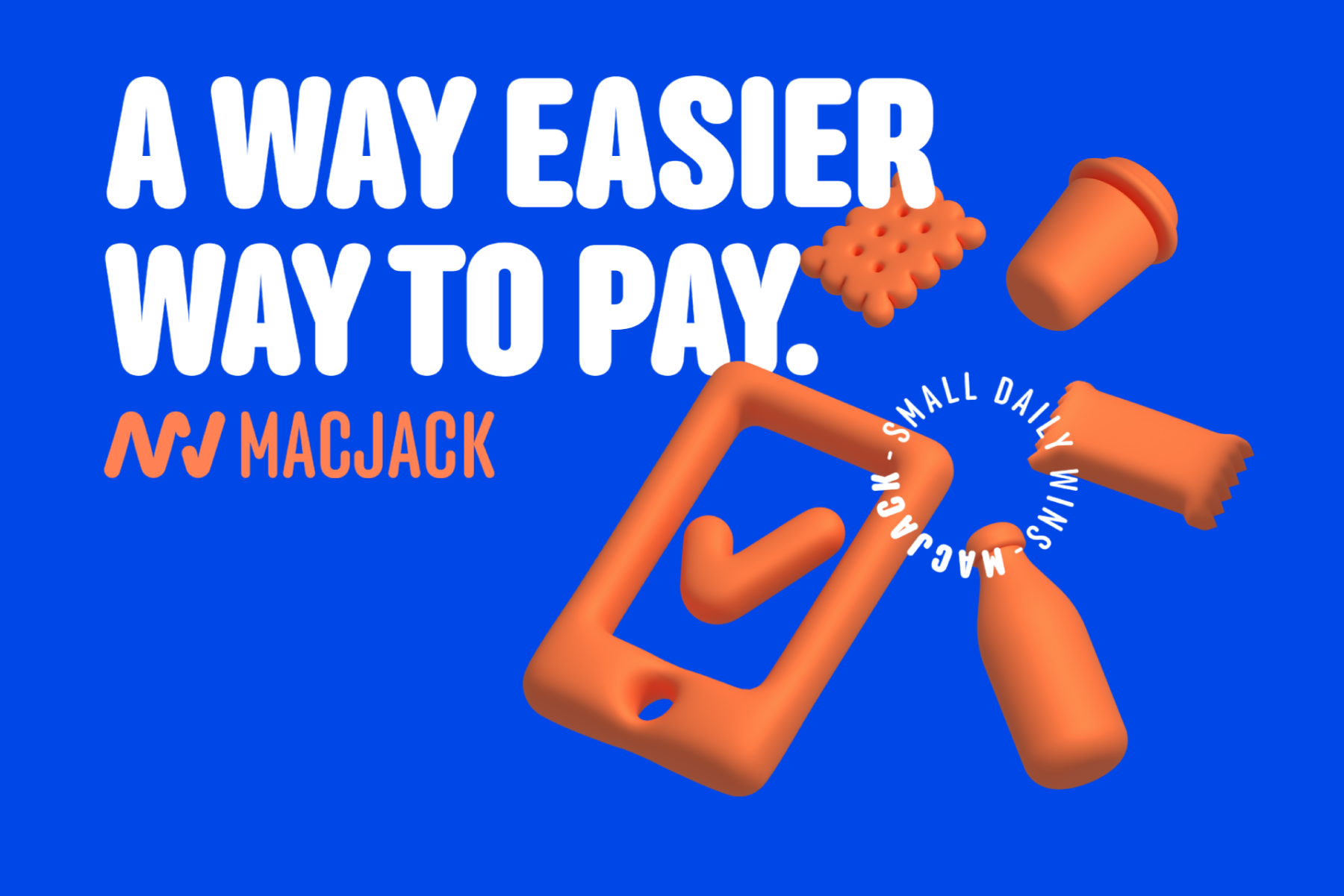
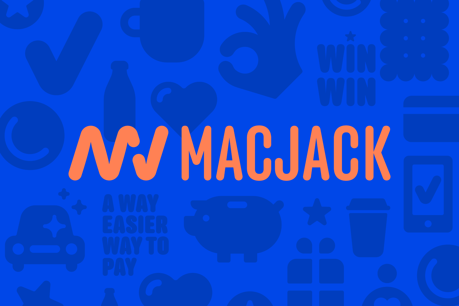
We named the new brand MacJack, mac is a friend who is always at hand, while jack is American slang for money, but also a “cool” person who lives a fulfilling life. We also created a new brand slogan “Small Daily Wins”, as well as a series of messages that playfully communicate the benefits of the brand, such as “A way easier way to pay”, “Small wins make life better” or “Lose the coins. Earn rewards. Either way, you win!”.
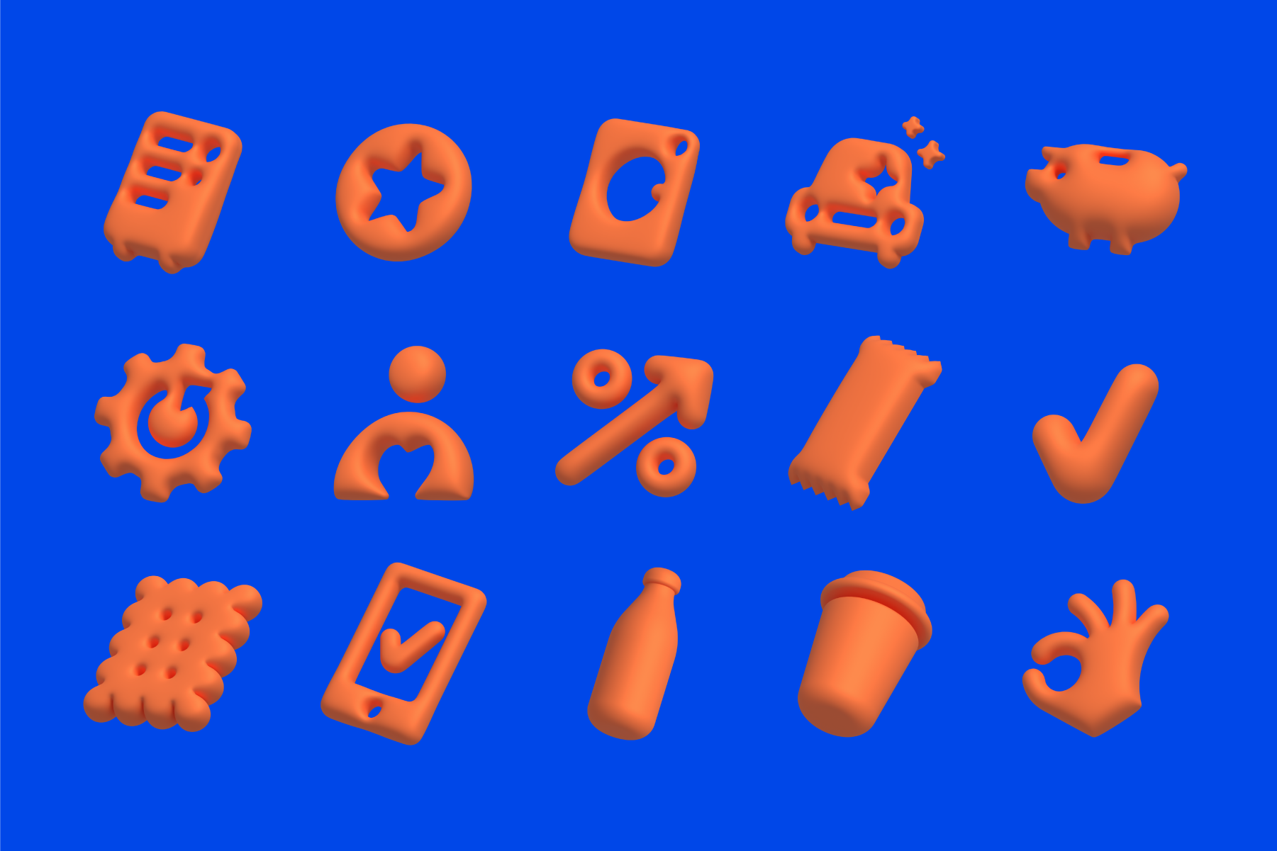
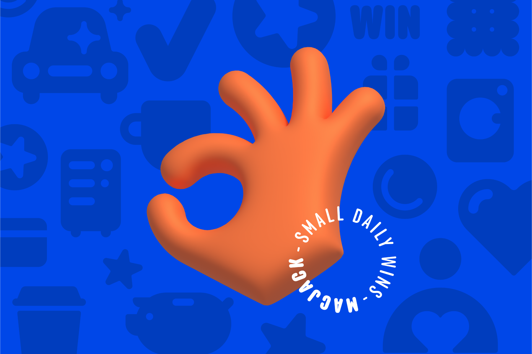
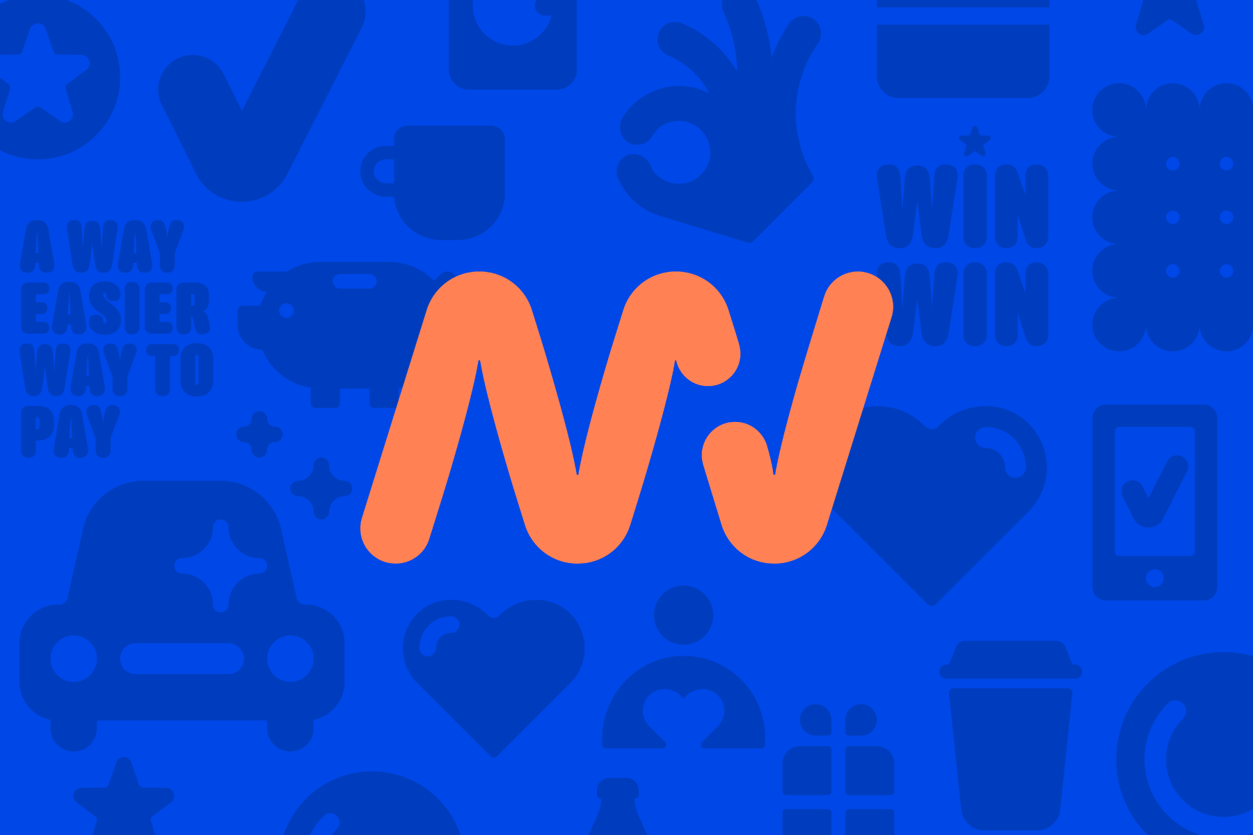
The modern and recognizable logo is enhanced by the letters M and J. At the same time, the letter J is also reminiscent of a checkmark, which indicates a completed action and a small daily win. The typography is modern and elegant, which indicates financial security, but also creates a feeling of a technologically advanced brand that makes payments simpler and faster. The colors are bright and vibrant and, together with the “checkmark” symbol and icons, contribute to the feeling of liveliness and cheerfulness that MacJack brings to everyday activities.
Brand Strategy & Creative Director: Anja Bauer
Senior Brand Consultant: Petra Despot Domljanović
Brand Consultant: Maja Đaković
Naming Consultant: Anja Bauer
Copywriter: Anja Bauer
Senior Brand Implementor: Jelena Mezga
ArtDirector, Designer: Damir Mazinjanin
Illustrator: Damir Mazinjanin

